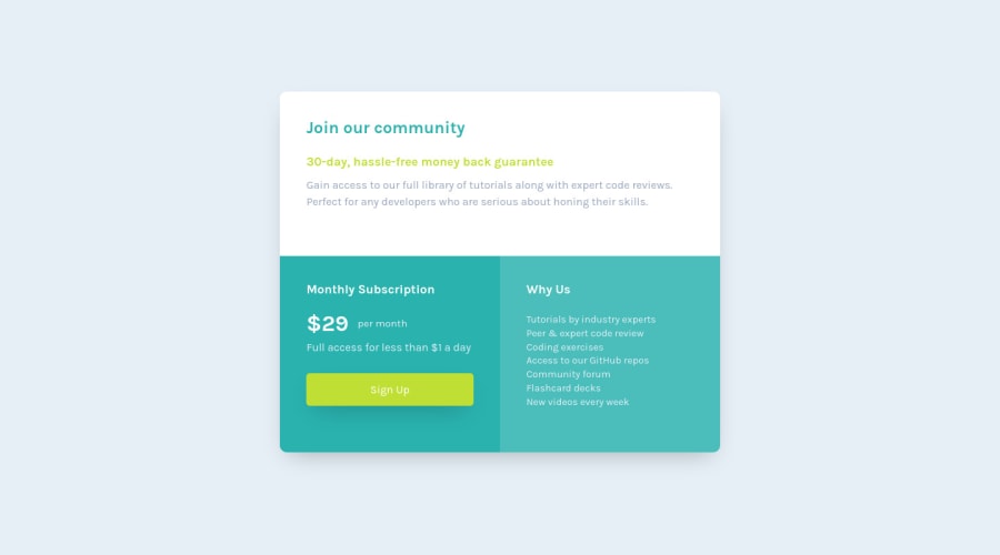
Design comparison
Solution retrospective
Hi Developer, take a look around my solution, I would be grateful to any feedback, Advice, Suggestion.
Community feedback
- @fidellimPosted about 3 years ago
Hi Ahmed!
Great work on this project! Just a suggestion, I might want to adjust your media query to a higher width as the screen width size decreases, the component's look feels too compacted.
@media (max-width: 770px)could be a great breakpoint.Hope it helps :)
Marked as helpful0 - @MojtabaMosaviPosted about 3 years ago
Take a look at the following:
1- Spend some time reading about mobile first since it helps to make thing responsive much easier without the need of writing a lot of media queries.
2 h1 is used for the main heading of a page so it should only be used once in a page, there is more to it than this but that's a good starting point.
Keep coding :=)
Marked as helpful0
Please log in to post a comment
Log in with GitHubJoin our Discord community
Join thousands of Frontend Mentor community members taking the challenges, sharing resources, helping each other, and chatting about all things front-end!
Join our Discord
