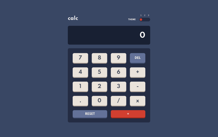
Design comparison
Solution retrospective
Although simple operations functioning as they should, there are some minor issues if the numbers are too large or too many decimal zeroes.
Theme switcher is using local storage, because I read readme file too late.))
Hopefully will switch to prefers-color-scheme soon.
Let me know what you think, always happy to hear your opinion!
Community feedback
- @mattstuddertPosted almost 4 years ago
Nice solution! You've matched your solution to the design really well. Nice work! 👍
As you mentioned, the calculator is working pretty well. But there are a few bugs in there. I'd recommend playing around with it some more and try ironing out those issues.
Also, I'd recommend reviewing the toggle. I'd expect to be able to click on 1, 2, or 3 and have it switch to the correct theme. But at the moment, it cycles between each one regardless of the option I choose. You could look into using radio inputs instead of a single
button. Thebuttonis also causing a HTML validation error at the moment because you're nesting adivinside it, which isn't valid HTML.One final thing: all of your calculator buttons are currently
divelements with event listeners on them. Avoid setting click listeners on non-interactive elements, like thedivelement. These can't be accessed by anyone not using a mouse/trackpad to navigate the content, which is a bad practice. Instead, add click listeners to interactive elements likeaorbutton. This will ensure the element is focusable and accessible by people not using a mouse/trackpad.I hope this helps! Keep up the great work! 🙂
1@olgak169Posted almost 4 years ago@mattstuddert Thanks for your feedback! All great suggestions, will definitely improve my solution with your help!
0 - @tedikoPosted almost 4 years ago
Hello, OK169! 👋
Congrats on finishing another challenge! Your solution works well! In addition to Matt great feedback - maybe add some
:activepseudo-class for your buttons to create "clicking" effect. Also, it would be nicer if you add transitions to this theme change. Also, from pure curiosity why do you addoverflow-x: scroll;to your.display?Good luck with that, have fun coding! 💪
0@olgak169Posted almost 4 years ago@tediko Hello! Good idea for the clicking effect! I didn't add much animation to the project because the design seemed quite minimal and when I tried to add hover effect it just didn't seem right. Some clicking effect however might look good. I added overflow-x because I didn't like how large numbers were displayed. Not the most elegant solution, but I couldn't think of anything better at the time.) Thank you for your feedback!
0
Please log in to post a comment
Log in with GitHubJoin our Discord community
Join thousands of Frontend Mentor community members taking the challenges, sharing resources, helping each other, and chatting about all things front-end!
Join our Discord
