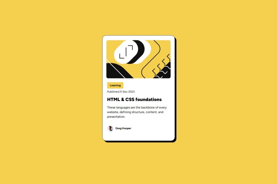
Design comparison
SolutionDesign
Solution retrospective
What are you most proud of, and what would you do differently next time?
Using variables and short time it took to make
Community feedback
- P@oridrPosted about 2 months ago
Overall looks good.
Issues:
- Prefer classes to ids, especially when an item (card) might appear multiple times.
- Height is a bit off
- Prefer REM unit to PX because it would resize on zoom, or if user changes the browser texts defaults. The standard default is 16px. You can compute all other sizes from it.
0P@davuplsPosted about 2 months ago@oridr
Respectfully disagree. The design isn't a website with multiple cards. Its one card so "id" in my opinion is appropriate. I agree about the REM.
0
Please log in to post a comment
Log in with GitHubJoin our Discord community
Join thousands of Frontend Mentor community members taking the challenges, sharing resources, helping each other, and chatting about all things front-end!
Join our Discord
