Design comparison
SolutionDesign
Solution retrospective
thanks for the feedback ^!
Community feedback
- @elidrissidevPosted over 3 years ago
Hey Burak! Great work on this challenge, keep going! Here are some advises on things to improve:
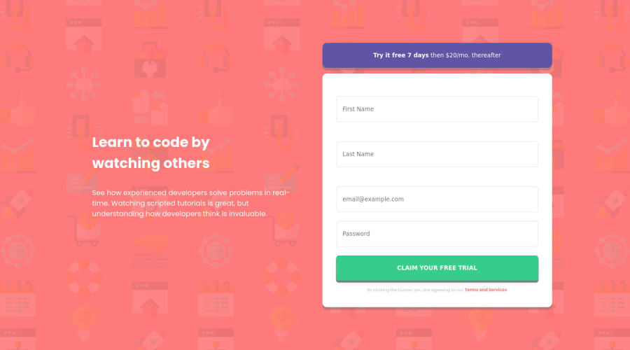
- In the design, the "Claim Your Free Trial" button has a shadow from the inside. You can achieve this in CSS by using
inset:box-shadow: inset 0 -0.25em 0 rgba(0, 0, 0, 0.1) - For the "Claim Your Free Trial" button, you've made the text all uppercase in your HTML. This means that screen reader software will spell it out letter-by-letter as if it was an acronym. In this case, it's better to style the button with
text-transform: uppercaseto make it uppercase visually. - Form validation works, but only shows one error at a time. I have a solution for this challenge where I'm using JavaScript's Constraint Validation API which I think will help you a lot, feel free to check it out.
- Additionally you can do some tweaking on the font sizes and spacing to make it look closer to the design.
I hope this didn't overwhelm you. Good luck!
Marked as helpful2@brkclnPosted over 3 years ago@elidrissidev Thanks for the replay.
- For validation, normally I used this.validation but I finished this project late at night. I couldn't do much.
- I am working on 720p old laptop, I can't see shadows very well. But I'll check what you said. thanks.. :)
0 - In the design, the "Claim Your Free Trial" button has a shadow from the inside. You can achieve this in CSS by using
Please log in to post a comment
Log in with GitHubJoin our Discord community
Join thousands of Frontend Mentor community members taking the challenges, sharing resources, helping each other, and chatting about all things front-end!
Join our Discord
