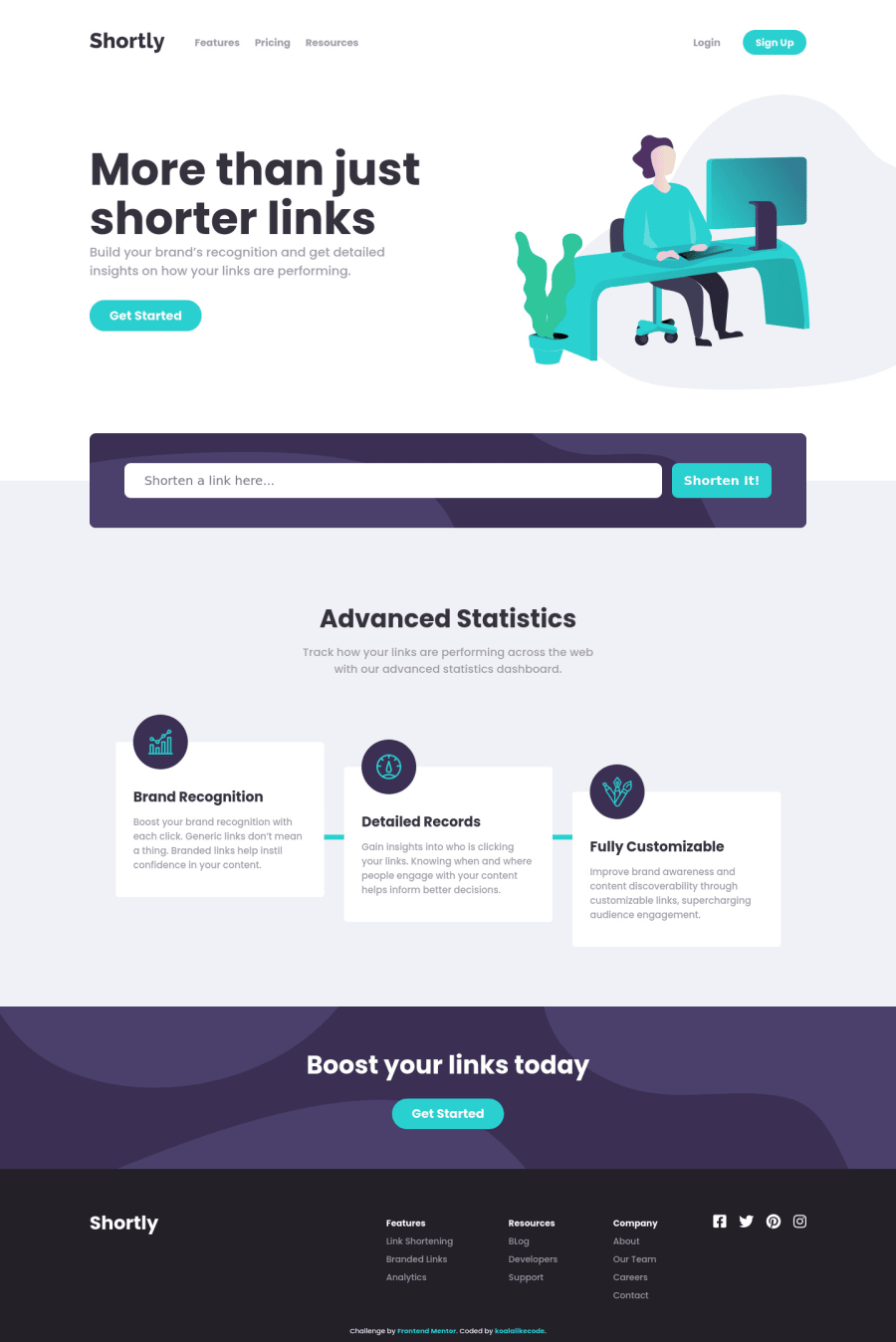
Shortly URL shortening API Challenge (Html, scss, flexbox, vanilla js)
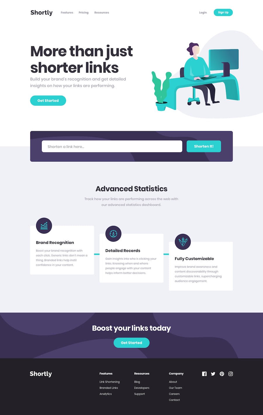
Design comparison
Solution retrospective
Hello everyone,
That is a nice challenge for practicing your skill with processing API, it also has some small tasks for CSS and js. I appreciate any suggestions or advice. Happy coding!
Community feedback
- @bramuccciPosted over 3 years ago
Hi Nguyen! This amazes me, it's beauty and clean like the original. Congratulations :D The only thing I would change it's the background in the setion-1, when I try it with different sizes it overlaps with the title. I played and think
background-size: 33em; background-position: top left -10emfor mobile it's good, and then other media querie withbackground position: top center. Background are hard, but maybe this help you. Oh and,cursor: pointer;in the social media icons will be great. Again, amazing solution!!!Marked as helpful0@koalalikecodePosted over 3 years ago@Liltanie thank you, bro. I have thought of the background and some cases too.
0 - @Nazeer2020Posted over 3 years ago
It is nice
0 - @dusanlukic404Posted over 3 years ago
Hey Nguyen, well done on this challenge, I am amazed how you did it!
0
Please log in to post a comment
Log in with GitHubJoin our Discord community
Join thousands of Frontend Mentor community members taking the challenges, sharing resources, helping each other, and chatting about all things front-end!
Join our Discord
