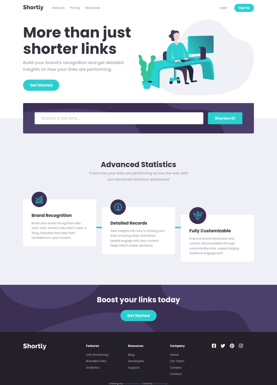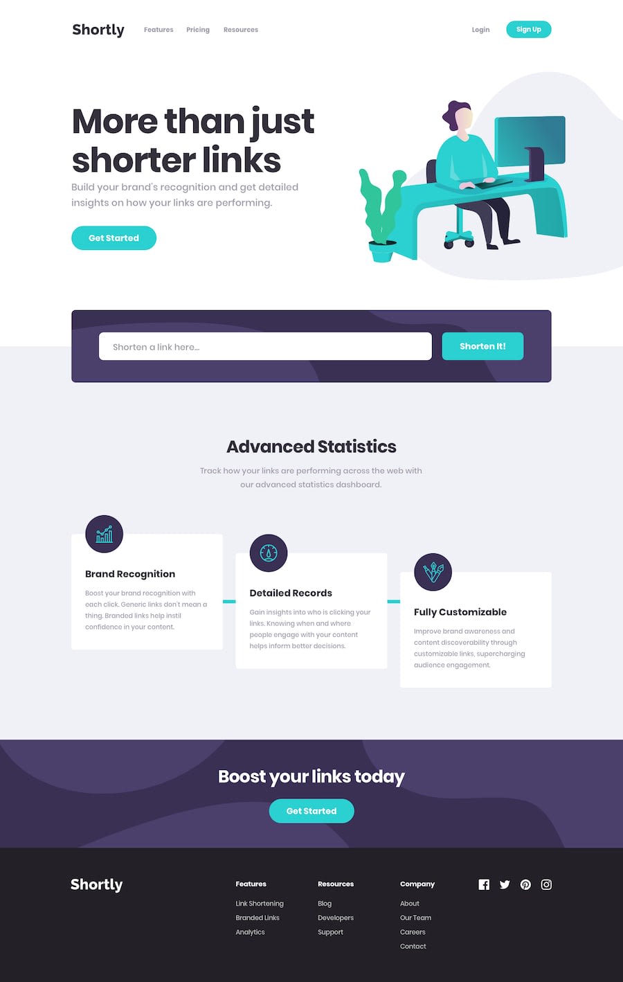
Design comparison
SolutionDesign
Community feedback
- @niemalPosted over 1 year ago
Hello there!
First off I would like to mention that the design implementation looks quite solid and I would like to congratulate you on that. Now to pinpoint some potential issues:
- Review the accessibility report errors and try to fix them.
- When typing "google.com" in the input field, it says I need to type a valid link. Perhaps reconsider making it strict to "https://" or "http://", you can indeed just post plaintext "google.com" to the API and get the same result. If the link is invalid, you can let the API itself derive that conclusion.
- There's also a scroll-burglar on the mobile version. You should reconsider the fixed width on something (I won't spoil!).
Keep having fun on the journey of web development, regards!
Marked as helpful1@Ecrb3Posted over 1 year ago@niemal Thank you so much for the feedback! I will Review my code to solve those problems 😊✌❤
0
Please log in to post a comment
Log in with GitHubJoin our Discord community
Join thousands of Frontend Mentor community members taking the challenges, sharing resources, helping each other, and chatting about all things front-end!
Join our Discord
