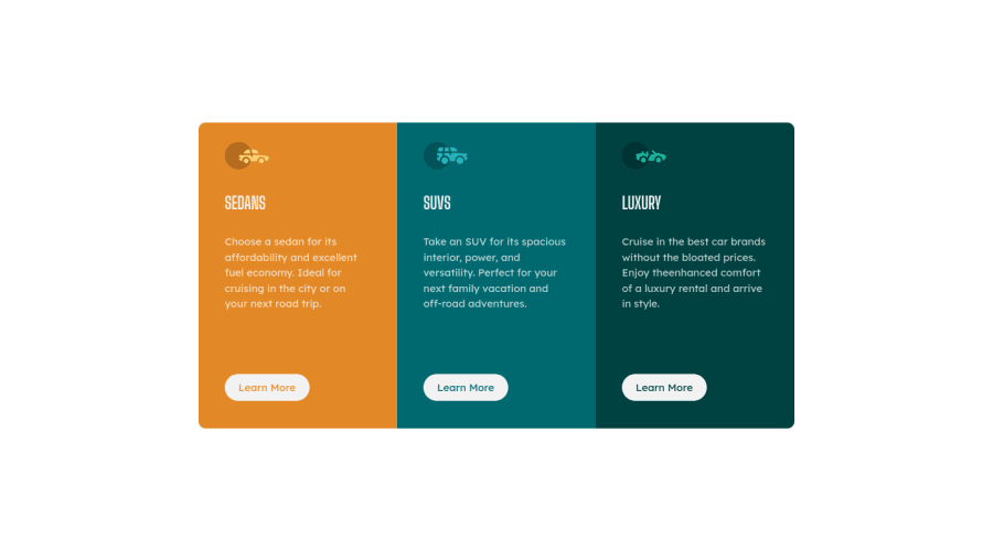
Design comparison
Solution retrospective
I update the HTML and CSS code because it is a bit mess (I think). I would really appreciate it if you give a feedback, especially in my HTML/CSS code. Thank you in advance.
Community feedback
- @vanzasetiaPosted over 3 years ago
👋Hi Ted!
I have some feedback on this solution:
- For the class naming convention, I recommend to use BEM Naming Convention.
- For the
srcvalue on everyimgtag. I would recommend you either add/(absolute file path) or./(relative file path). It will clarify where the images are. To learn more you can check my blog post about file path. - Only have one
h1on every page. Swap allh1withh2. - Add
widthandheightproperties to every image for better CLS(Cumulative Shifting Layout). For more info, you can check web dev article about optimize CLS. - Avoid using
!importantflag. In this case you don't need it at all.
a:hover{ border: 2px solid var(--color-content); background-color: transparent; color: var(--color-content) !important; }- The
bodybackground color should be grayish color, not white.
That's it! Hopefully this is helpful!
Marked as helpful1@ted-dinoPosted over 3 years agoHi @vanzasetia,
I edit the HTML and CSS code. I would really appreciate it if you check it again and see if there is still I need to change/remove to make it more readable or easy to maintain. Thank you very much, your comment really helps me.
0@vanzasetiaPosted over 3 years ago@ted-dino Yeah, but it's okay in this project since it's not a full website. But, you can fix the issue by adding a hidden
h1and search "for thesr-onlyclass styling" for theh1.<h1 class="sr-only">Preview Card Component</h1>It will visually hidden, but if you use your screen reader, it will still be able to read the text.
1 - @Dharmik48Posted over 3 years ago
Hello,
Your solution is really good! Looks great! But just one thing you add is a transition on hover for the buttons, it will make the experience better.
Keep up the good work!
Marked as helpful1@ted-dinoPosted over 3 years agoHi @Dharmik48,
Yeah I think it would really look great if I add some functionality but my main goal is to make it look a little bit the same as the design provided inside the starter file and I'm still new to this Web Dev thing so I don't know how to do that. Maybe in the future I will add some animation/transition to make it more beautiful.
Thank you for you feedback, really appreciate it.
0@ted-dinoPosted over 3 years ago@Dharmik48 hey man, I updated the site. I add transitions in links. If you have time, please tell me what you think. Thanks!
0@Dharmik48Posted over 3 years ago@ted-dino Great!😄 It feels way better now!
Marked as helpful1
Please log in to post a comment
Log in with GitHubJoin our Discord community
Join thousands of Frontend Mentor community members taking the challenges, sharing resources, helping each other, and chatting about all things front-end!
Join our Discord
