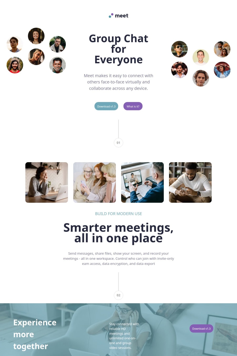
Design comparison
Solution retrospective
Finishing first that big project
What challenges did you encounter, and how did you overcome them?Making all "media-queries" for this project. I had some hard time solving this.
What specific areas of your project would you like help with?Some advices for making websites of size of full screen, I had some troubles with positioning things on screen so they dont get totally misplaced when someone resizes his screan
Community feedback
- P@2XG-DEVPosted 5 months ago
I feel like overall you made it work.
The thing with figuring out how to layout things, is you should start with the mobile layout as that is the easiest one. From there on you need a good understanding of using both flexbox and grid. Flexbox might be "easier" but it can give you headaches.
For example with the images section that is way easier in grid, just a display grid and grid-template-column: repeat(2,1fr) for mobile and a media query with repeat(4,1fr) for tablet/desktop
Try using
img {
  display: block;
  max-width: 100%;
}
as part of your CSS reset in every project to make images easier to work with.
Always use the inspector tools in the browser and make sure everything fits in its little square. Always think of layouts in term of squares.
Also always use variable properties like max-width instead of fixed widths
Marked as helpful0
Please log in to post a comment
Log in with GitHubJoin our Discord community
Join thousands of Frontend Mentor community members taking the challenges, sharing resources, helping each other, and chatting about all things front-end!
Join our Discord
