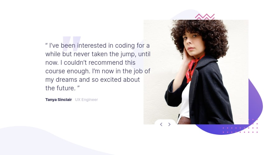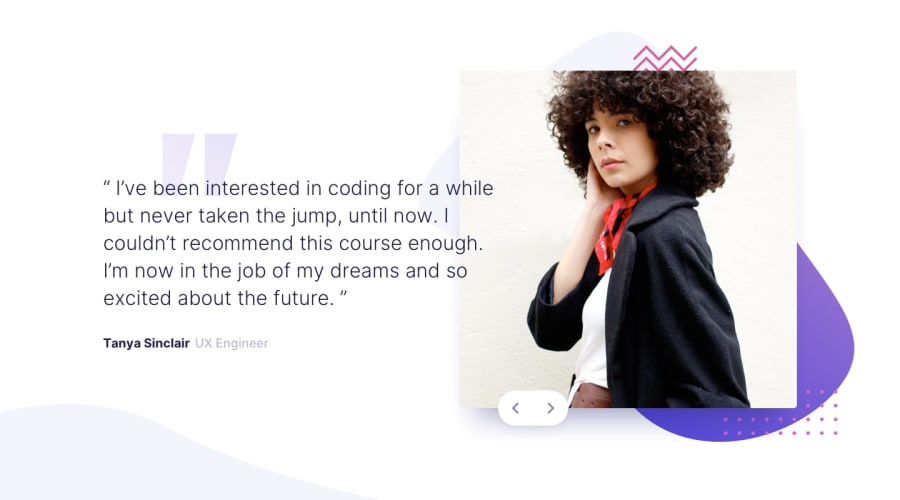
Design comparison
Solution retrospective
This looked ease at first but challenged me a lot. i had to restart over at some pointswhen everything wasnt working. my major concern is the buttons. As you can notice my button layout breaks when you adjust for different mobile screens.
-
how did you approach approach laying out the buttons? did you use buttons for each indivual page? or just a single pair of buttons absolutely positioned like i did?
-
i haven't touched on accessibility yet because i need to solve that button layout that is bugging me
-
more comments and corrections are welcome
Community feedback
- @avatarfreakPosted over 3 years ago
- Good work, Design-wise it is good and responsive.
- For the button try using
pseudo-element.
::afteror::before. - In my opinion, it is easier to target elements. As it will always be relative to its immediate parent. something like this example.
.image-container{
    position:relative;
}

.image-container::after{
    content:'';
    position:absolute;
    top:0;
    left:0;
    width:100%;
    height:100%
}
Marked as helpful0
Please log in to post a comment
Log in with GitHubJoin our Discord community
Join thousands of Frontend Mentor community members taking the challenges, sharing resources, helping each other, and chatting about all things front-end!
Join our Discord
