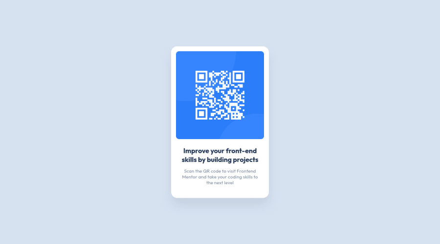
Rotating QR Card Component
Design comparison
Solution retrospective
Would appreciate any advice on where and how to get better. Thank you x
Community feedback
- @lucsnPosted about 3 years ago
For some reason when translating the page into Portuguese the spaces in the copyright do not work properly the "Challenge byFrontend Mentor" (without the space between the by and the link). I already had this problem and solved it with "&+nbsp+;(only remove the "+" because when I write without it literally becomes a space hahaha)" .
Nice work, congratulations :))
Marked as helpful1@anoshaahmedPosted about 3 years ago@Lucsn oh wow thank u for teaching me that Lucas!
0 - @arkharman12Posted about 3 years ago
Tested on iPhone 13 with Safari, the card flip animation seems to be having trouble. The card is already flipped and the text appears backward.
Marked as helpful1@anoshaahmedPosted about 3 years ago@arkharman12 i know i noticed :/ i wonder how to fix it
0@arkharman12Posted about 3 years ago@anoshaahmed Look into this question on Stackoverflow ( https://stackoverflow.com/questions/22559756/changing-hover-to-touch-click-for-mobile-devices ). Or convert your hover effect to a click instead when on smaller screens.
1@anoshaahmedPosted about 3 years ago@arkharman12 Fixed the issue. but it’s still not perfect
0@anoshaahmedPosted about 3 years ago@arkharman12 Fixed the issue. but it’s still not perfect
0 - Account deleted
Congratulations!! Keep coding <3
1 - @PrAnAvViNaYaKjAdHaVPosted about 3 years ago
That hover animation is too nice 😀😀😀😀😀😀
1 - @i-5iiciPosted about 3 years ago
Great work Anosha, that is a nice touch!
1 - @mnizhadali-afgPosted about 3 years ago
@anoshaahmed - Brilliant Anosha Jan! I have issues with the challenge (Profile Card), can you help with that, please?
1@anoshaahmedPosted about 3 years ago@mnizhadali-afg for sure, what's the problem?
1@mnizhadali-afgPosted about 3 years ago@anoshaahmed - Thank you, dear! Actually, I saw your code and now the (background-position ) problem is solved right now :)
1 - @AmmarCodePosted about 3 years ago
Perfect application of the design! Great work, keep it up👍
1 - @rafael-the-devPosted about 3 years ago
Congratulation for the great job, keep it up.
1 - @therealmaduanusiPosted about 3 years ago
I just love how you tackled these quickly when it's was just released. great job wishing you the best😁
1 - @dieudonneallognonPosted about 3 years ago
@anoshaahmed hey, I really like your work ! Was wondering what tool do you use to attend perfect pixel code ? Thanks !
1@anoshaahmedPosted about 3 years ago@dieudonneallognon The design that FEM provides
0 - @viniciusshenri96Posted about 3 years ago
great job, the rotation was very good.👏
1 - @xZAYEDxPosted about 3 years ago
adding the rotation to the card was really creative 👍
1 - @Kamasah-DicksonPosted about 3 years ago
I think after rotation, your name could have been a link to your frontendmentor bio or any.
I realised after rotation when I tap on the card again it doesn't go back to the QR code I don't know if it is because am on mobile. Besides that's a great work there😎👍 Anosha :)
1@anoshaahmedPosted about 3 years ago@Kamasah-Dickson Yeah there are some issues on phone :/
0@anoshaahmedPosted about 3 years ago@Kamasah-Dickson Fixed the issue. but it’s still not perfect
0 - @bilal1836Posted about 3 years ago
Looks 👌🏻 nice one ✔
1 - @skyv26Posted about 3 years ago
Keep it Up 🔥🔥🔥
1 - @NaveenGumastePosted about 3 years ago
This looks dope! Nice work
1 - @ChamuMutezvaPosted about 3 years ago
Great solution Anosha, well done
1 - @Ayon95Posted about 3 years ago
Hi, your solution looks great. Good job on going the extra mile and implementing a rotating card. I looked at your HTML code and noticed that you used a <div> for 'card__side--back'. I think a <section> is a better choice as you have done for 'card__side--front'. The front side and back side of the card are like two sections of it.
1@anoshaahmedPosted about 3 years ago@Ayon95 i wanted to but
<section>requires a heading :/ so it would have created an accessibility issue1@Ayon95Posted about 3 years ago@anoshaahmed Hmm fair point. I guess using a <div> in this case is not a problem.
Marked as helpful0
Please log in to post a comment
Log in with GitHubJoin our Discord community
Join thousands of Frontend Mentor community members taking the challenges, sharing resources, helping each other, and chatting about all things front-end!
Join our Discord
