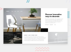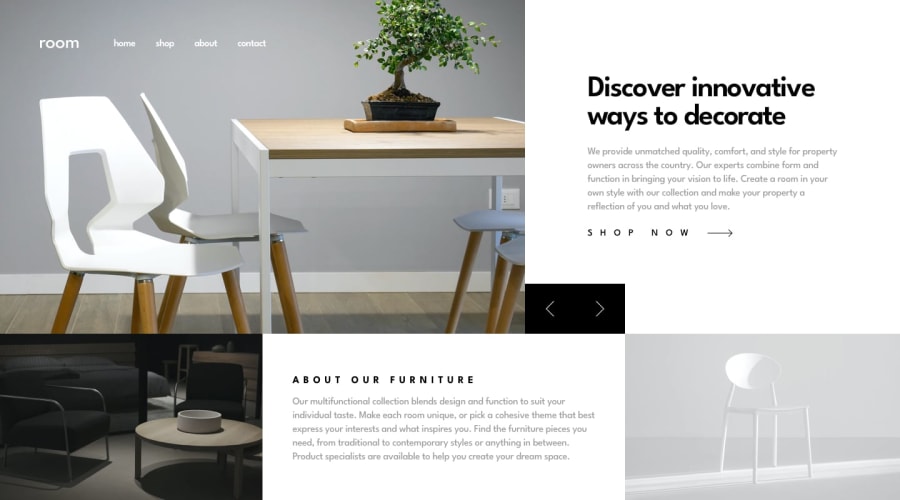
Design comparison
SolutionDesign
Solution retrospective
feedbacks are appreciated.
Community feedback
- @tedikoPosted over 3 years ago
Hello, Ritesh Jangra! 👋
Well done on this challenge! 🎉 Here's a few things I'd suggest you to take a look at:
- Read about semantic. Semantic elements lead to more consistent code, they are easier to read and improve accessibility.
- Make use of semantic elements. Your navbar links should be
anchor <a>elements instead of paragraphs..arrow-btnimages should be wrapped into<button>element since it will trigger some action..show-btnshould be alsoanchorelement.
Keep up the good work! 💪
1 - @palgrammingPosted over 3 years ago
⭐⭐⭐⭐⭐ Looks Great... Good job on this challenge
1
Please log in to post a comment
Log in with GitHubJoin our Discord community
Join thousands of Frontend Mentor community members taking the challenges, sharing resources, helping each other, and chatting about all things front-end!
Join our Discord
