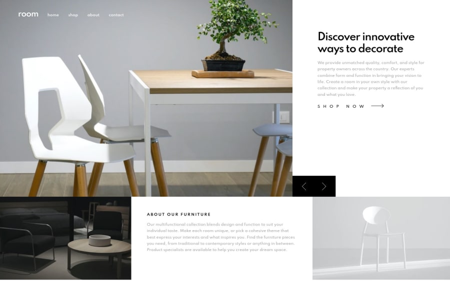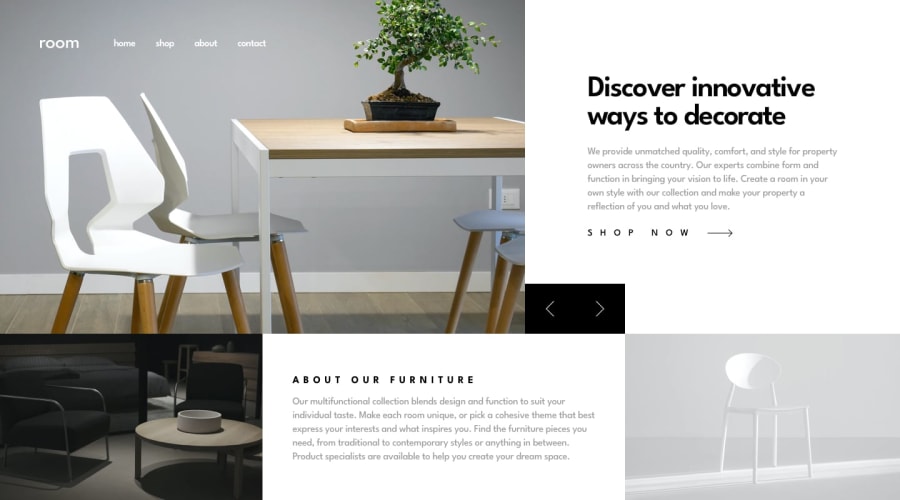
Design comparison
Solution retrospective
Any feedback is welcome :)
Community feedback
- @skyv26Posted over 3 years ago
Hi! Harmanjot, I hope you are doing good. I checked your work and design responsiveness too. I have some suggestions rather than only pointing out issues.
-
I hovered over your navigation menu and I saw your menu text shifted upwards and back to original position once I left menu. I would like to suggest you either add animation so that lifting effect little bit seems beautiful Or you can do one thing by changing your code little bit by adding
border: 2px solid transparent;in your all anchor tag and on hover effect just add `border-bottom-color: white;' this will makes your menu content stable. -
In mobile view, your arrow are going outside the viewport towards right and little bit bottom overlaped by the second section. Here I would suggest you to wrap your arrows inside the another div and use absolute positioning to fix at the particular place.
-
In mobile response logo in not aligned center. use flexbox to fix it.
Overall good work.
Best of Luck
Marked as helpful0 -
Please log in to post a comment
Log in with GitHubJoin our Discord community
Join thousands of Frontend Mentor community members taking the challenges, sharing resources, helping each other, and chatting about all things front-end!
Join our Discord
