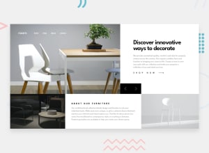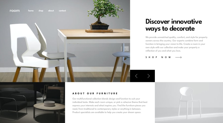
Design comparison
Solution retrospective
Hello everyone ! 🙂
My code is quite messy because I was too absorbed to make things work with my CSS, next time I'll make sure to think twice before coding haha.
My main goal was too make it responsive I hope it's working. Any remark/feedback is appreciated !
Have a nice day ☀️
Community feedback
- @ApplePieGiraffePosted about 4 years ago
Hey, Enayar! 👋
Great job on this challenge! I'm happy to see that your solution scales up well in addition to scaling down (something many others often don't implement in this challenge) and I love the way your solution responds from desktop to tablet to mobile! 😍
The mobile navigation is also really sweet—nice work on that. 👏 The only things I might suggest are adding a hover state to the navigation links in the desktop layout of the site and perhaps finding some way to preload the slider images so that there is no delay between when one of the slider buttons is pressed and the next image is shown for the first time. 😉
Keep coding (and happy coding, too)! 😁
2@RayaneBengaouiPosted about 4 years agoThank you APG for the comment ! I'll work on the navigation you're right ! 🙂
0
Please log in to post a comment
Log in with GitHubJoin our Discord community
Join thousands of Frontend Mentor community members taking the challenges, sharing resources, helping each other, and chatting about all things front-end!
Join our Discord
