Design comparison
Solution retrospective
Feedbacks are appreciated.
Community feedback
- @tedikoPosted over 3 years ago
Hello, Ritesh Jangra! 👋
Good job on this one! 🎉 Good job on this one. Your
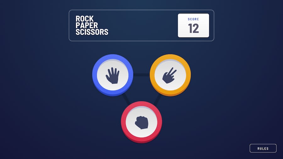
.buttonelements with rock/paper/scisor are missplaced on different screen sizes. Use Responsive Design Mode to see how your website behaves on different devices. To toggle it pressCTRL+SHIFT+Mon Firefox, andCTRL+SHIFT+Con Chrome.Good luck with that, have fun coding! 💪
1@riteessshhPosted over 3 years ago@tediko thank you for the feedback. I did use responsive design mode, could you please specify the problem in this project.
0@tedikoPosted over 3 years ago@riteessshh Sure. I use 1920x1080 monitor and on that resolution your paper and scissors buttons are placed correctly and your rock button is separated from them.
0
Please log in to post a comment
Log in with GitHubJoin our Discord community
Join thousands of Frontend Mentor community members taking the challenges, sharing resources, helping each other, and chatting about all things front-end!
Join our Discord
