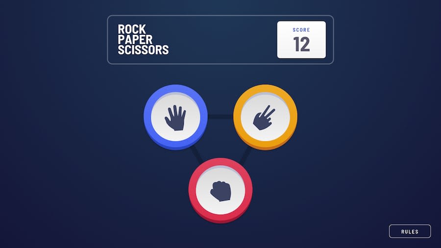
Design comparison
Solution retrospective
Hello everyone, this is my first advanced challenge on frontendMentor it was quite challenging and i struggled the most in css because i tried to recreate it as close to the design as possible so i would appreciate your feedback , remarks on how i can improve it any comment is appreciated and thank you for your time
Community feedback
- @Victor-NyagudiPosted almost 2 years ago
Nice work! This is a really good effort.
Your HTML is missing an
<h1>though, and your<section>tags don't have an<h2>or lower tag.Each web page needs an
<h1>because this is the first thing screen readers read out loud to people with poor vision telling them about the page. As they navigate down to each<section>, the screen reader also reads the section heading telling them what that section is about.You can add these tags and style them in such a way that screen readers can still recognize them, but they're out of view for people with good eyesight.
Here's an example of an
<h1>with a class,for-screen-readers, and styled such that it's out of view..for-screen-readers { position: absolute; left: -100000000; // very large number so it's out of view height: 1px; width: 1px; // if it somehow appears on screen, it'll be too small to see overflow: hidden; }Good job on using semantic tags though. A lot of people still rely too much on
<div>tags.All the best with future solutions.
0 - @DonUggioniPosted about 2 years ago
Hey Eya,
Great job on finishing this project 👍 I noticed the score goes below zero, is that how it's supposed to be or should it be >= 0?
Also the background color when you hover the options look a little too strong visually, but that is just my personal taste.
Keep it up!
Happy coding 🤓
0
Please log in to post a comment
Log in with GitHubJoin our Discord community
Join thousands of Frontend Mentor community members taking the challenges, sharing resources, helping each other, and chatting about all things front-end!
Join our Discord
