Submitted about 2 years ago
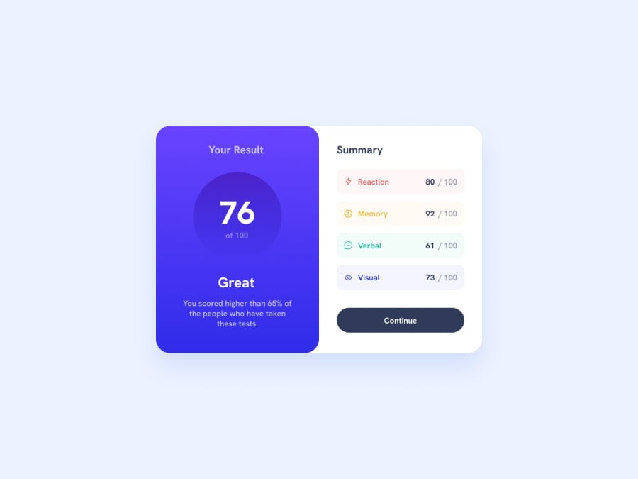
Result-Summary-Component
#accessibility#contentful#fresh#materialize-css#styled-components
@TarundeepJoshi
Design comparison
SolutionDesign
Community feedback
- @FabianWassermannPosted about 2 years ago
Great work! Here are some points for improvement.
- You can use more padding to let the content breath.
- Make sure you are using the right font weights. The button text is too thin.
Keep it going!
Marked as helpful0@TarundeepJoshiPosted about 2 years ago@FabianWassermann ok bro and thanks for support...
0
Please log in to post a comment
Log in with GitHubJoin our Discord community
Join thousands of Frontend Mentor community members taking the challenges, sharing resources, helping each other, and chatting about all things front-end!
Join our Discord
