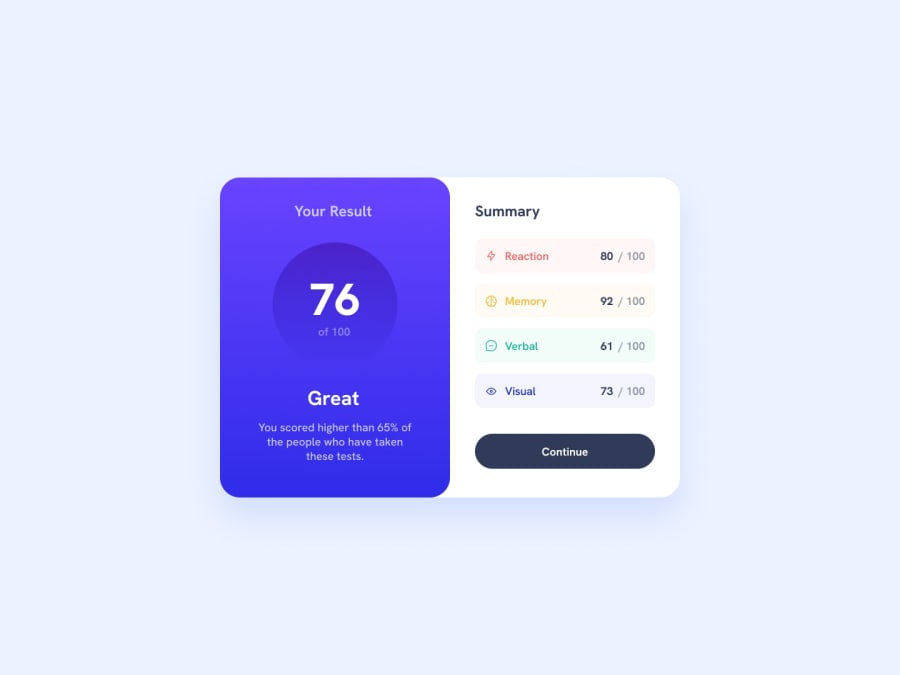
Design comparison
Solution retrospective
In this project, I could learn so many things like background linear-gradient property. I have come across margin collapsing there was a problem to solve then I have found the solution for margin collapsing. First, it was a problem to convert the mobile layout to a desktop layout then I used Flex and some of the CSS rules then I finally completed the project.
Please log in to post a comment
Log in with GitHubCommunity feedback
- @climb512
Looks nice!
I have a couple of tips that you might want to consider to make life easier:
-
You can start most css projects with a "css reset", which just overrides the basic default behavior of some items and solves things like your "margin collapse" problem. There are many css-resets recommended online by pros like Kevin Powell -- the one I use regularly is from Andy Bell: https://gist.github.com/Asjas/4b0736108d56197fce0ec9068145b421
-
The one visual issue with your solution is that it isn't centered vertically on the page. You can center things vertically pretty easily by giving the parent element a height and setting display:flex (or grid); with justify-content: center; and align-items: center;
Like this for your site:
body {
height: 100vh;
display: flex;
justify-content: center;
align-items: center;
}
Hope this helps you on your journey!
Marked as helpful -
- @kjdeepak
Hi Nishant, Please consider following points:
- Fix border radius in desktop view.
- Use right font family as per given design.
Great work.
Join our Discord community
Join thousands of Frontend Mentor community members taking the challenges, sharing resources, helping each other, and chatting about all things front-end!
Join our Discord
