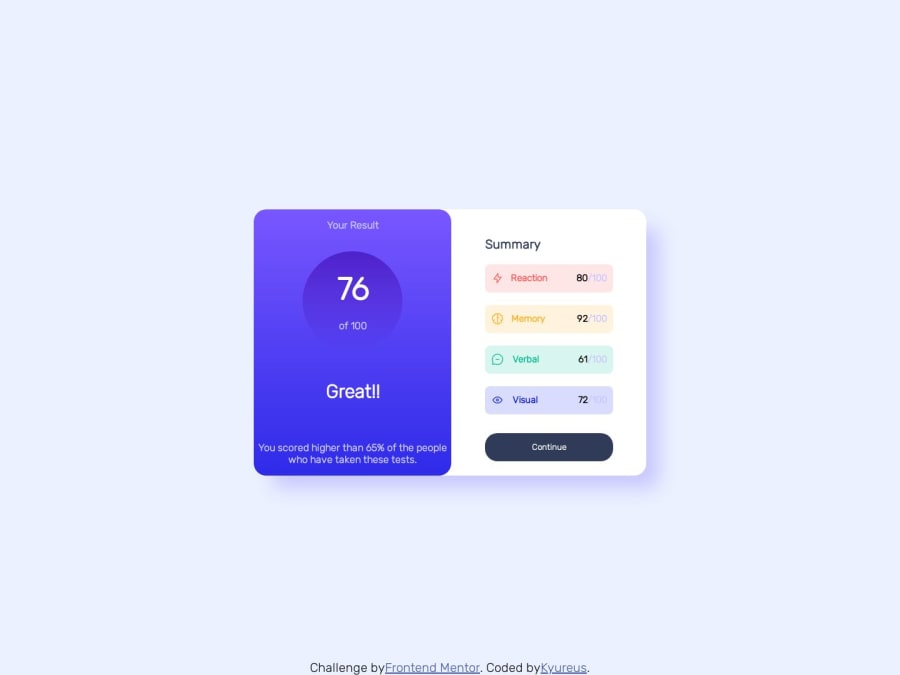
Design comparison
Solution retrospective
resposive solution is different from that sugested in the challenge, but i think it fits right and i also added a hover function so it can show the content boxes one over the other.
Community feedback
- @hitmorecodePosted over 1 year ago
Congratulations well done.
/* this line here is breaking the responsiveness. set it to a higher value, it will fix it */ #results { height: 50px; /* if you set it to around 400px it will look good */ }1@Kyureus1Posted over 1 year ago@hitmorecode the intention of that that was to make a hover for the "results" box so it would collapse over the "summary" box when people touch on it, that's why only the upper end of the results box is visible but honestly that was not intuitive enough, so i made some changes. Thanks!
0@hitmorecodePosted over 1 year ago@Kyureus1 Ah ok got it. Then maybe you should add this to make the transition smoother
#results { transition: all 350ms ease-in-out; /* add this line */ height: 60px; color: var(--Light-lavender); }1@Kyureus1Posted over 1 year ago@hitmorecode That really helped! Thank you so much for the support!
0
Please log in to post a comment
Log in with GitHubJoin our Discord community
Join thousands of Frontend Mentor community members taking the challenges, sharing resources, helping each other, and chatting about all things front-end!
Join our Discord
