

Design comparison

Solution retrospective
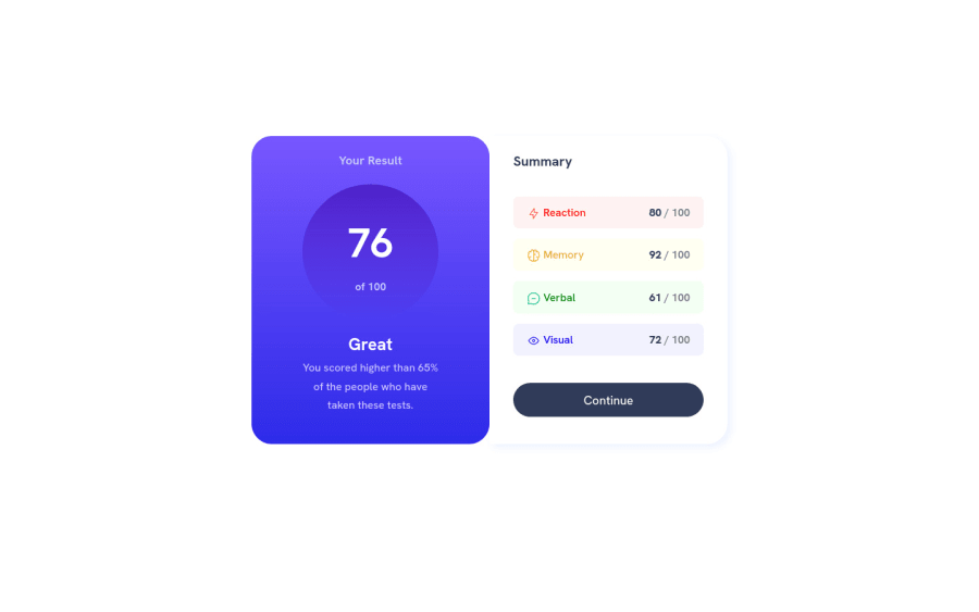
Hello ! I try my best :) Feel free to comment. Thanks for you help. See ya :)
Community feedback
- @visualdennissPosted over 1 year ago
Hey there,
very nice work! The card itself looks pretty good, however some suggestions:
It looks like you used some workaround to center the whole card, but the usual way is to give the body following rules:
- min-height: 100vh;
- display: grid;
- place-items: center;
But with your current setup, it'll cause some issues at first, this is because you've made the individual parts of the summary component (left and right) direct children of the body. Instead there should be a main tag (as the report says also) so you can freely apply these to the body, and main tag should wrap the left and right columns of the component, it gives you more freedom. So use a wrapper element (main) first and refactor the code as necessary. (Example, transfer your current code for the body to main, - remove the margin, then apply the rules above with min-height etc to the body afterwards.)
- Additionally, you should be using cursor: pointer; to the buttons to indicate interactivity, as well as background-color change would be ideal.
Hope you find this feedback helpful!
Marked as helpful1 - @0xabdulkhaliqPosted over 1 year ago
Hello there 👋. Congratulations on successfully completing the challenge! 🎉
- I have other recommendations regarding your code that I believe will be of great interest to you.
HTML 🏷️:
- This solution generates accessibility error reports, "All page content should be contained by landmarks" is due to
non-semanticmarkup, which causes lacking of landmark for a webpage
- So fix it by wrapping the both
<div>elements using the semantic element<main>in yourindex.htmlfile to improve accessibility and organization of your page.
- What is meant by landmark ?, They used to define major sections of your page instead of relying on generic elements like
<div>or<span>. They are use to provide a more precise detail of the structure of our webpage to the browser or screen readers
- They convey the structure of your page. For example, the
<main>element should include all content directly related to the page's main idea, so there should only be one per page
CSS 🎨:
- let me explain, How you can easily center the component for better layout.
- We don't need to use
marginandpaddingto center the component both horizontally & vertically. Because usingmarginorpaddingwill not dynamical centers our component at all states
- To properly center the component in the page, you should use
FlexboxorGridlayout. You can read more about centering in CSS here 📚.
- For this demonstration we use css
Gridto center the component
body { min-height: 100vh; display: grid; place-items: center; }- Now remove these styles, after removing you can able to see the changes
body {
   margin: 20rem auto;
}
.
I hope you find this helpful 😄 Above all, the solution you submitted is great !
Happy coding!
Marked as helpful1 - @ecemgoPosted over 1 year ago
This comment was deleted over 1 year ago
0@visualdennissPosted over 1 year ago@ecemgo giving this
body { min-height: 100vh; }
right away would cause issues, there needs to be some refactoring in the code first (as i've explained above in my comment).
No, he/she should not be replacing the <div class="results"> with <main> but .results and .summary needs to be wrapped inside <main>. There is big difference. .results is simply left column, not the whole or main thing on the page. And, as your resource article suggests as well:
"the main heading of the page is declared using <h1> which enables screen readers to recognise it as the heading at the highest level, and with the most importance. There are then three headings defined at the next level using <h2>."
this means there should be only one <h1> per page. See "Note: Only use one <h1> per page - this should represent the main heading/subject for the whole page." on https://www.w3schools.com/tags/tag_hn.asp as well.
So <h2> here are correct as they are used but instead of div, it should be replaced with a <section>.
There is no explicitly given h1 here on this challenge, but he/she can add one saying "Results Summary Component" and use .sr-only (screen-read only) class to make it invisible, not remove from the DOM with display: none;
Marked as helpful1


Please log in to post a comment
Log in with GitHubJoin our Discord community
Join thousands of Frontend Mentor community members taking the challenges, sharing resources, helping each other, and chatting about all things front-end!
Join our Discord