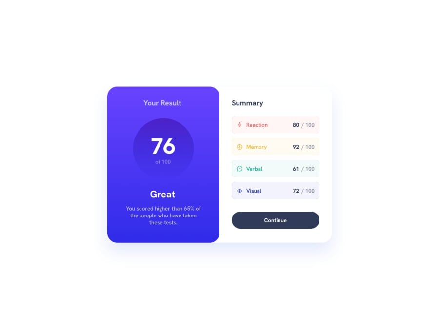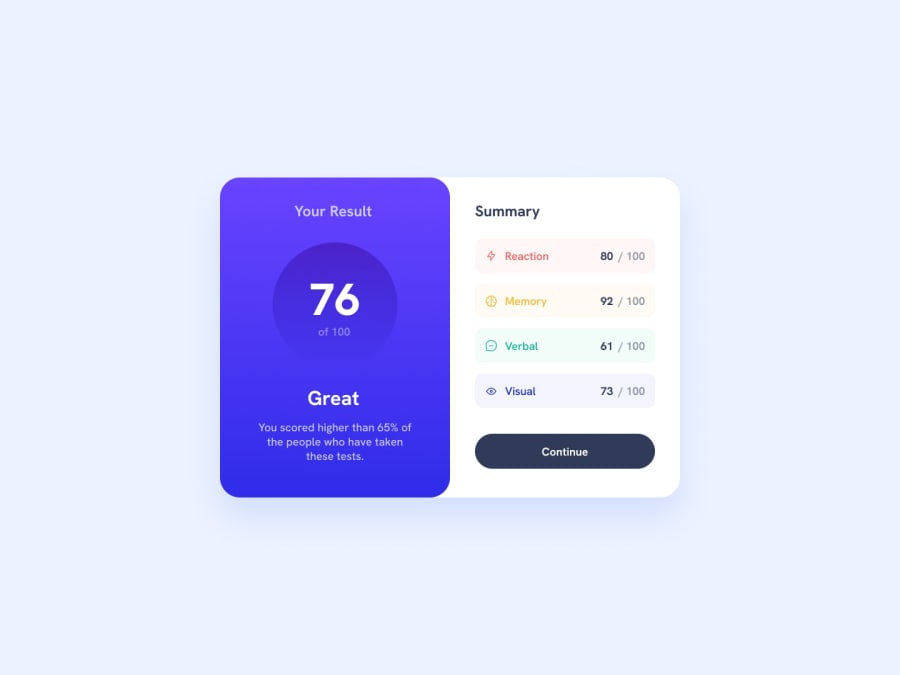
Results Summary Component (HTML | CSS | JS Vanilla => animejs library)
Design comparison
Solution retrospective
...made with a lot of love 🤘🏻🙂
Community feedback
- @carlosriesePosted over 1 year ago
Hey man, whats up?
I love to see your challenges solutions and how it's looks like exactly like the challenge request. My goal as "Ever evolving" Frontend dev is reach a similar level of work like yours. Can i ask you something? How you get those results? Its your experience as dev and/or you unlock the pro resources (like figma) to improve your accuracy in the challenges? tks
2@CheospherePosted over 1 year ago@carlosriese Hello bro, thank you very much for your comment, the truth is that I am obsessed with achieving a development that is identical to the UI design, I do this with my knowledge of graphic design, carefully measuring the jpg file that is provided in the folder of the project, I do it this way since I don't have the pro version to access the figma resources, it takes me many hours of work and stress, but I like to do it that way. In some projects I think that the image capture carried out by the platform has favored me, since there are always small differences between the UI design and the development, differences that have gone unnoticed in the image capture of the project.
6@carlosriesePosted over 1 year agoNice @Cheosphere. Hope one day i can do it like you do. I dont have the the photoshop app but gonna try it these tips on GIMP. Tks for your answer.
1 - @ABU-BAKAR-SPosted about 1 year ago
Your project is awesome bro. Go ahead. I want to try the animation like this.
1 - @verakissyou17Posted about 1 year ago
Hi! You did a great job and your design is almost perfect. The animation is a plus and is very cute. Congratulations for your project! ☺☺☺
1@CheospherePosted about 1 year agoHello @verakissyou17, thank you very much for appreciating my work 😻
1 - @AskTibaPosted over 1 year ago
Now that's so good it's inspiring. I will definitely have look through your work process in the code. Good job.
1 - @gavharoyabdurahimovaPosted over 1 year ago
Hello, simply wonderful!! I liked how you compared it to 1:1.
1 - @turboo-syPosted over 1 year ago
hey bro i like ur solution man it amazing <3 , so please tell how to get height and width ....etc, for any solution its really hard for me to try it without any help , thank you so so much <3
1 - @NaQu2003Posted over 1 year ago
Hi, it looks great! I wanted to ask also how you do it that your websites look 1:1 to designs?
1@CheospherePosted over 1 year ago@NaQu2003 Hello bro, thank you very much for your comment, what I do is open the "desktop-design.jpg" file, in Photoshop or Illustrator, and using the ruler tool (setting its unit of measure to pixels) I can get the sizes, spaces and margins of each of the elements. The same process applies to the mobile version, which is found in the "mobile-design.jpg" file. You can also access the files in Figma, but for that you need to get the Pro version of Frontend Mentor. The truth is that I am obsessed with making my development as close as possible to UI design, this causes me terrible stress hahaha and also many hours of work on fine details, but I like doing it that way.
5
Please log in to post a comment
Log in with GitHubJoin our Discord community
Join thousands of Frontend Mentor community members taking the challenges, sharing resources, helping each other, and chatting about all things front-end!
Join our Discord
