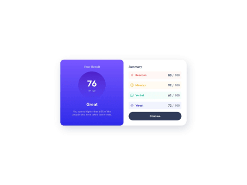
Submitted about 1 year agoA solution to the Results summary component challenge
Results Summary Component GRID and Flexbox
@lois-m

Solution retrospective
What are you most proud of, and what would you do differently next time?
Declare my color in variables.
Next time i will declare it without HSL to add it when i need it.
What challenges did you encounter, and how did you overcome them?Manage gap in grid. There are some different spacing between element in the page that i didn't see at first
Code
Loading...
Please log in to post a comment
Log in with GitHubCommunity feedback
No feedback yet. Be the first to give feedback on lois-m's solution.
Join our Discord community
Join thousands of Frontend Mentor community members taking the challenges, sharing resources, helping each other, and chatting about all things front-end!
Join our Discord