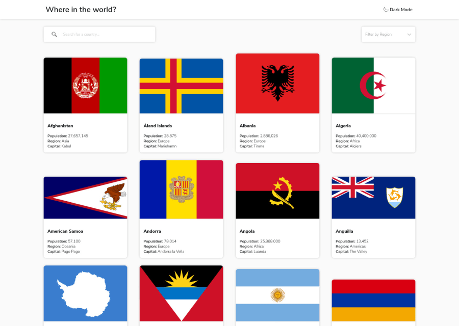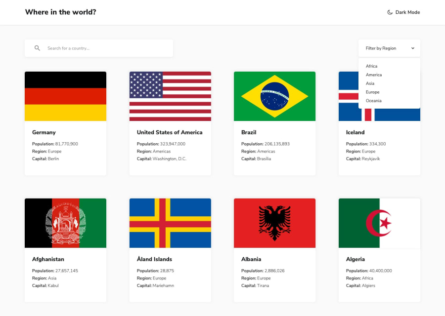
Design comparison
Solution retrospective
One of the possible improvment I thought of is to load or display the later parts of the list when it's necessary (when scrolled to it) and I plan on doing some research on this and how it affects the performance. So if someone got some reading materials about that that he could provide to me I would be grateful.
Community feedback
- @JesusAtao96Posted about 4 years ago
Hello Karel Klečka 👋
Excellent work on this challenge 🎉🎉🎉.
Add on the body, header and your other elements with background-color
transition: background-color .5s, now press the dark / light button and the background color change is smoother ✨.Happy coding 😊.
1@KlekarPosted about 4 years ago@JesusAtao96 Hi, thanks. I tried adding transition but at list, there is too many elements that do the transition so it resulted in very laggy and wierd animation on my machine so I decided to omit that unless I implement a way to reduce number of rendered elements in the list that would do the transition.
0
Please log in to post a comment
Log in with GitHubJoin our Discord community
Join thousands of Frontend Mentor community members taking the challenges, sharing resources, helping each other, and chatting about all things front-end!
Join our Discord
