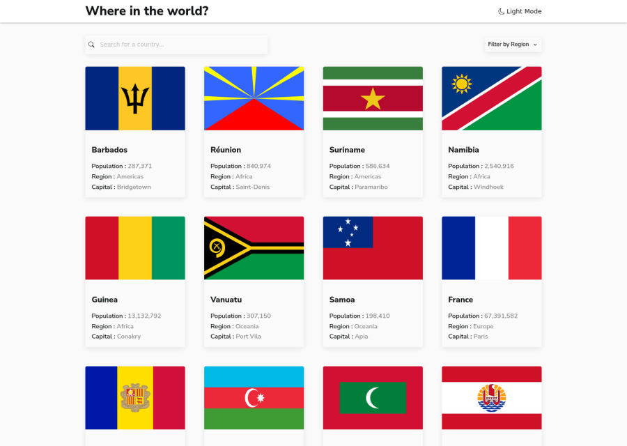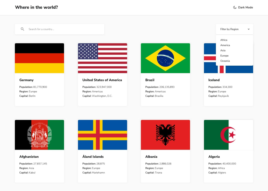
Design comparison
Community feedback
- @niemalPosted over 1 year ago
Hello there,
I must commend your effort in creating such an engaging and user-friendly experience. I will be doing this review for the mobile version of the website.
I would like to bring to your attention a few areas that could benefit from further refinement. Firstly, I encountered a "scroll burglar" issue that hindered the smooth navigation of the web page. Addressing this problem would enhance the overall user experience and make browsing more enjoyable.
Secondly, I noticed that the "filter by region" button was not functioning as intended. Ensuring that this feature works seamlessly would significantly improve the usability.
Lastly, within each country's dedicated page, I found that the border buttons were not linking to the actual country page so perhaps that's a feature to implement.
Kind regards and best wishes!
0@kodcapsulePosted over 1 year ago@niemal Thanks for the detailed review i will work on the recommendations and resubmit.
0
Please log in to post a comment
Log in with GitHubJoin our Discord community
Join thousands of Frontend Mentor community members taking the challenges, sharing resources, helping each other, and chatting about all things front-end!
Join our Discord
