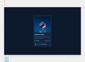
Design comparison
Solution retrospective
it was good time to build this project ,let me know your advice about my code. a real question for my self: when can we say 'front-end' programmer to ourself?
Community feedback
- @pikapikamartPosted almost 3 years ago
Hey, great work on this one. As Aakash already said about the layout, for the desktop view it is too big and scaling it down would be really nice. But on the other hand, the mobile state looks really great to be honest since it scales down.
For some other suggestions, here are some:
- Avoid using
height: 100vhon a large container like the.generalselector as this makes the element's height capped based on the viewport/screen's height. Instead usemin-height: 100vhso that the element will expand if it needs to. - For the nft image, as you can see it is being treated as an interactive component because it is having a
:hoverstate which shows a preview-icon that I think could be clicked by the user. Meaning that there should be an interactive element present alongside with it or nesting it. You can use eitherbuttonoratag depending on what you think will happen when clicking the image. If it shows a pop-up to view the full nft then go withbuttonbut if clicking it will redirect user in another page, then useatag. - The nft image could use the nft name as the
altvalue so that it will be much clearer especially when there is an interactive element that nest the image. You could go withalt="nft Equilibrium #3429". Although it still doesn't describe the whole nft image but still, an nft is to be seen right. - The nft name could be using an
h1on this since a singleh1is needed on a page. Also, the nft name is being treated as interactive as well so using anato wrap theh1text-content would be nice:
<h1> <a href=""></a> </h1>- Avoid using
idto target and style an element since it is a bad practice due to css specificity. Instead, just useclassto target element. - The ethereum icon and the clock-icon is only decorative on this one although you could use
altfor the eth icon since it is a real currency, but looking at this layout, there will be lots of other nft in here as well when this is a real site so meaning there would be lots of eth icons as well. So for this, each of the icon usingalt=""andaria-hidden="true"so that they will be hidden for screen-reader. - Person's
imgcould use the person's name as thealtvalue since it is already present. - Don't know why you change the person's name on this one though, but change the
spanintoatag sincespanis not supposed to be interactive element. - Lastly, just addressing the sizing issue on the desktop state:>
Aside from those, great job again on this one.
Marked as helpful1@anoshaahmedPosted almost 3 years ago@pikapikamart Hey those are some really useful advices. Thank you from a newbie!
1@roastgrammerPosted almost 3 years ago@pikapikamart holyyyyy dude! I will use these advice , they are very good,tnx :)
1 - Avoid using
- @skyv26Posted almost 3 years ago
Hi! Buddy, Nice try. But have an issue too.
- Your NFT card is really bigger in size as compared to design preview, if we keep design preview aside then I would say Design is not comfortable to like, my first reaction on page load is like I saw only image, I mean my focus went only on image first and after on the rest part. It is called as Bad User Experience because design not that much pretty.
Good but need some more practice.
Best of Luck
0@roastgrammerPosted almost 3 years ago@skyv26 tnx for your response , i will make next one better tnx again
0
Please log in to post a comment
Log in with GitHubJoin our Discord community
Join thousands of Frontend Mentor community members taking the challenges, sharing resources, helping each other, and chatting about all things front-end!
Join our Discord
