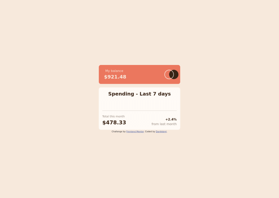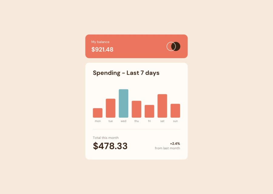
Design comparison
Solution retrospective
It was an interesting practice! I'm happy that I was able to finish in one afternoon. Sizing is still challenging - if you have any tips to improve, I'd really appreciate that!
Community feedback
- @MavreonPosted over 2 years ago
Hello Danilo, great work on this! I went through your code base and woahhh!! That's a lot of javascript code. Now I'm not trying to be all "My code is better than yours" kind of situation, I want to show a possibly easier way of going about this, I'm not all confident but I think you could observe a lot from my codebase. You could also please comment on my code if you can, ways I can make it better. Here is a link to my repo: Mavreon Codebase.... I hope this helps in ways I think it could.
0@danilobmlPosted over 2 years ago@Mavreon Thank you! I'll definitely love to take a look, but it seems like the link you sent is not working...
0@MavreonPosted over 2 years ago@danilobml Hmmm it's working on my end .... Here it's is again
https://github.com/Mavreon/Expenses_Chart_Component
0
Please log in to post a comment
Log in with GitHubJoin our Discord community
Join thousands of Frontend Mentor community members taking the challenges, sharing resources, helping each other, and chatting about all things front-end!
Join our Discord
