Submitted over 3 years ago
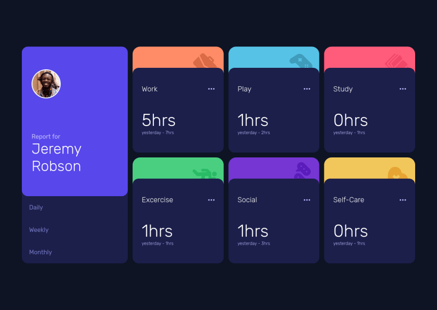
Responsive time tracking dashboard using Flexbox and CSS Grid.
#accessibility#sass/scss
@naser23
Design comparison
SolutionDesign
Community feedback
- @MaryEhbPosted over 3 years ago
You have done a great job this far this design can be really tricky I just have some recommendations hope they help
- in filter time period class, the list should be selected and colored white when the site is previewed (weekly choice)
- the vertical spacings need to be decreased
- the title of boxs is white not gray
- when boxs are hovered their color should change to a lighter one
- the color of the three dots icon should be white when hovered
0
Please log in to post a comment
Log in with GitHubJoin our Discord community
Join thousands of Frontend Mentor community members taking the challenges, sharing resources, helping each other, and chatting about all things front-end!
Join our Discord
