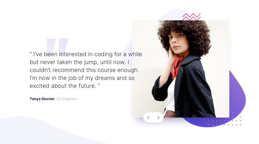
Design comparison
Solution retrospective
Not proud but beginning to code with JavaScript. I handle one event for both buttons (previous and next) using a custom data attribute (data-direction) to store additional information about an element (in this case, the tag). I know I don't need it for this challenge, but it will be helpful if I have more than two authors.
What challenges did you encounter, and how did you overcome them?Mobile-first doesn't always work. In this case, I spent a lot of time trying to implement this approach, but ultimately, I ended up creating two styles and organizing my code accordingly using SASS
What specific areas of your project would you like help with?I’m always open to any advice and comments...thank you all 😋
Community feedback
- @YacoubDweikPosted 3 days ago
Hey Bro!
Good job man just please please please get rid of that footer I hate seeing it hahaha.
About Mobile-First Approach I don't know what you have faced but take this as a general rule, if the design is simple on Mobiles and then get more and more complicated as the screen gets wider then use Mobile-First, otherwise no start with Desktop-First, you simply start with the simple design then you go from there.
Keep it up my man!
Marked as helpful1 - @Djamel1133Posted 3 days ago
Hi, I am happy that you're doing well.
For MFA, I learned that lesson by the hard way... Regarding the footer, you will not seen it, just to make you happy...
Feel free to give any feedback or advices.Thanks again... Keep in touch.
1
Please log in to post a comment
Log in with GitHubJoin our Discord community
Join thousands of Frontend Mentor community members taking the challenges, sharing resources, helping each other, and chatting about all things front-end!
Join our Discord
