Design comparison
SolutionDesign
Solution retrospective
What are you most proud of, and what would you do differently next time?
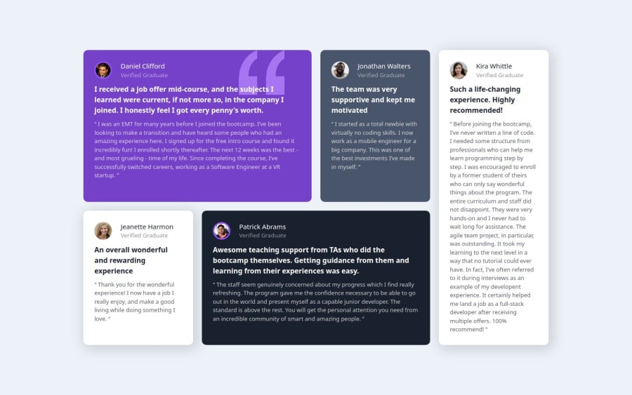
Life becomes easy when you learn grid-template-areas 😊.
Community feedback
- P@jamiethomas1Posted 7 months ago
Love the extra grid layouts for in between mobile and desktop, missing the font though. Needs to be imported at the top of the CSS file.
Marked as helpful0@Coder-SadikPosted 7 months ago@jamiethomas1 Thanks for your feedback, I'll update the font.
0
Please log in to post a comment
Log in with GitHubJoin our Discord community
Join thousands of Frontend Mentor community members taking the challenges, sharing resources, helping each other, and chatting about all things front-end!
Join our Discord
