Submitted about 2 months ago
Responsive testimonials grid section | htm5, css3

P
@okayishmael

Design comparison
SolutionDesign

Solution retrospective
What are you most proud of, and what would you do differently next time?
Mixing grid and flexbox to achieve my goal.
What challenges did you encounter, and how did you overcome them?The design indicated 13px font size.16px/ 1rem is what I used for readability. I some people can see to well. I am just advocating for users
What specific areas of your project would you like help with?My is seems a little bigger.
Community feedback
- P@dlemvighPosted about 2 months ago
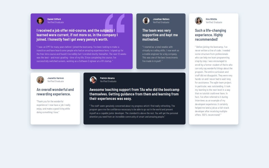
The Visuals
- Looks really good
- Avatar outlines a bit different than design, but looks good
- Nice 4, 3, and 1 column layouts
- A bit extra body margin on mobile layout compared to design, making the content very squezed on when get below 400px
- Missing "watermark" on purple card (also found it annoying to add myself without getting it on top of the text, but find a nice way by setting
background-imageon the card).
Visually really good, only small notes
The Code
- The is an attempt at css grid, but then a lot of flexbox inside doing most of the work (
grid-template-columns: repeat(6);- repeat is missing its second parameter so gets ignored) - A bit of grid and flexbox nesting, would have been nice to have been done with a single grid. Maybe using
orderto put the "kira" card on the bottom. - Well structured html
- Nice use of css variables
Flexbox usage really good. Grid usage could have been better. But in general really nice solution
0P@okayishmaelPosted about 2 months ago@dlemvigh For the for the review. I made changes.
0

Please log in to post a comment
Log in with GitHubJoin our Discord community
Join thousands of Frontend Mentor community members taking the challenges, sharing resources, helping each other, and chatting about all things front-end!
Join our Discord