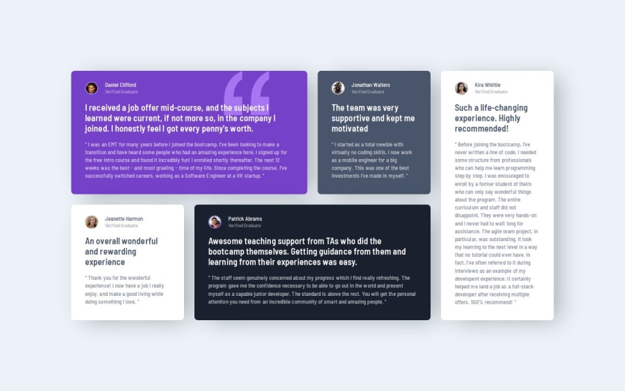
Responsive Testimonial Cards using CSS Grid
Design comparison
Solution retrospective
- Any advice on how to use BEM more efficiently
- Please let me know if I made any mistakes in using semantic HTML tags
- Any Sass advice on how I can use it to make the code DRY (for eg - use of mixins)
Community feedback
- P@ValsCodesPosted 6 months ago
Great job! Sematic HTML looks okay, might want to look more into it so you can feel more confident when using it. The layout is great, great touch with the 3 media queries. The mobile version at least in my opinion could use a max-width set to something lower. Very good separation of logic with the SASS. Even for a small project as this it very nice to see order in good shape. There aren't any considerable differences. Your purple testimonial's quote should have a different opacity and the box shadow seems a little bit more than needed. All minor stuff.
Keep going!
Marked as helpful0
Please log in to post a comment
Log in with GitHubJoin our Discord community
Join thousands of Frontend Mentor community members taking the challenges, sharing resources, helping each other, and chatting about all things front-end!
Join our Discord
