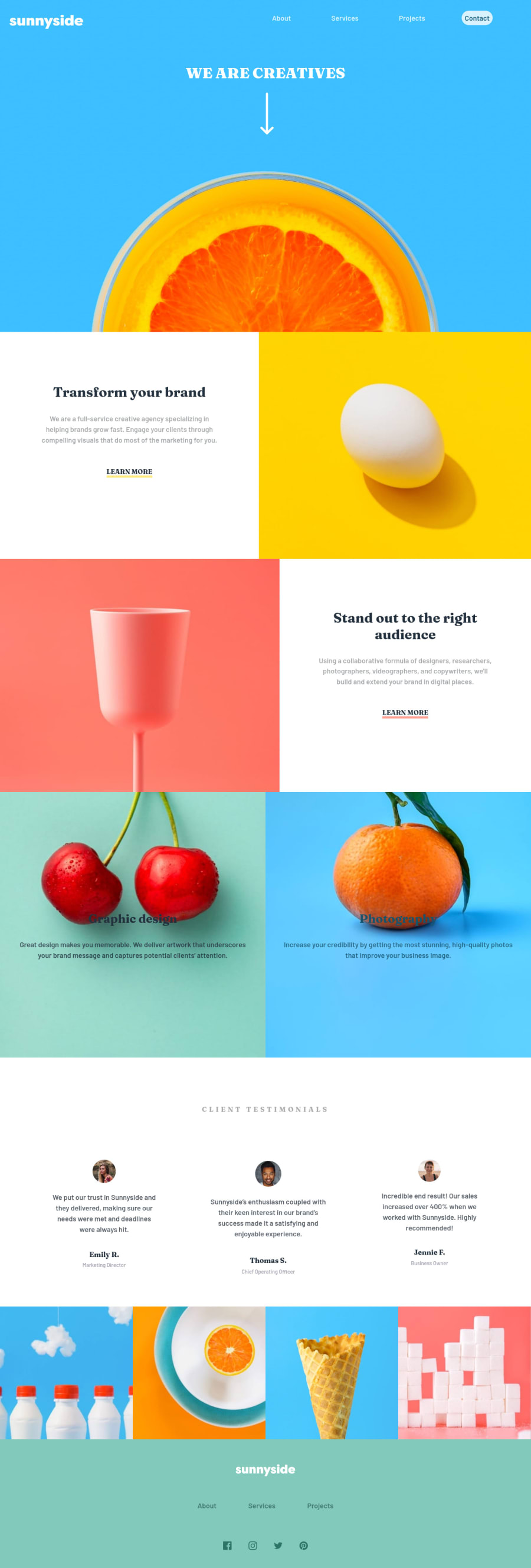
Design comparison
Solution retrospective
how could I get the shape above the mobile menu ? and changing the color of the logo in the footer?
Community feedback
- @skyv26Posted almost 3 years ago
Hi! Alsir, I hope you are well and good, You made this design really good with all your efforts and with the knowledge you have, and I can understand it took maybe a day to complete this challenge but still there are few issues that are written below:
-
You second section images (Set of 6) are not aligned to each other to the center and the reason is you hadn't assign equal proporation of width to both image and div container, just add
width: 50%to img and div (.box) container. A little bit more work solve your alignment issue. -
You second last portion have same issue, but most importantly, by default have
display: inline;property. Just change it todisplay: inline-block;and removewidth: 100%you images will then visible with equal size. -
You have directly assigned the social network icon with img tag but it should contain the link so that if anyone click on of them then he/she referred to that social network link to explore further. Use anchor tag to make them link.
-
When I hover on any of navigation menu then your list item's margin increase or decreases , it should not be behave like this. (Fix it)
5 . Give more padding to contact button to make it look little bit more better.
Fix your above issues then it will also improve you mobile view little bit.
I hope you understand.
Good Luck
1 -
Please log in to post a comment
Log in with GitHubJoin our Discord community
Join thousands of Frontend Mentor community members taking the challenges, sharing resources, helping each other, and chatting about all things front-end!
Join our Discord
