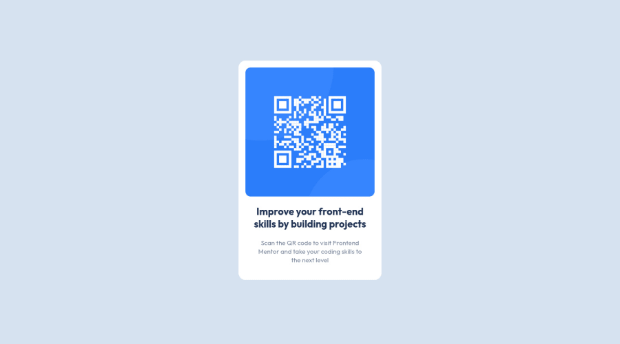
Responsive solution utilizing flexbox in one page with in-style CSS
Design comparison
Community feedback
- @MelvinAguilarPosted about 2 years ago
Hello there 👋. Good job on completing the challenge !
I have some suggestions about your code that might interest you.
HTML 📄:
-
Wrap the page's whole main content in the
<main>tag. -
The <div> tag defines a division or section on a website. It is used to style a container with CSS, set special alignment, or position content. It might be more efficient to use the <p> tag; the <p> element represents paragraph-level content, usually text:
<p>Scan the QR code to visit Frontend Mentor and take your coding skills to the next level</p>- The text
Improve Your Front-End Skills by Building Projectsis considered a heading element (h1).
- You should not use inline-CSS because it is not a good practice. Instead, you should use an external stylesheet to style your page. By doing this, you will be able to have a better organization of your code and will be able to understand it better.
- Since this component involves scanning the QR code, the image is not a decoration, so it must have an
altattribute. Thealtattribute should explain its purpose. e.g.QR code to frontendmentor.io
CSS 🎨:
- Instead of using pixels in font-size, use relative units like
emorrem. The font-size in absolute units like pixels does not scale with the user's browser settings. This can cause accessibility issues for users who have set their browser to use a larger font size. You can read more about this here 📘.
I hope you find it useful! 😄 Above all, the solution you submitted is great!
Happy coding!
1@niemalPosted about 2 years ago@MelvinAguilar Thank you for taking the time to review my submission!
Regarding in-line CSS, I am a react geek anyway so I just saw solving this quickly and with no framework.
I am also well aware that rem unit specifically scales quite well compared to the other units, I just had to follow the guidelines and instructions of the challenge.
Just noticed the design comparison widget as well, seeing I missed some pixels and the box-shadow. I will leave this be as is!
Cheers!
0 -
Please log in to post a comment
Log in with GitHubJoin our Discord community
Join thousands of Frontend Mentor community members taking the challenges, sharing resources, helping each other, and chatting about all things front-end!
Join our Discord
