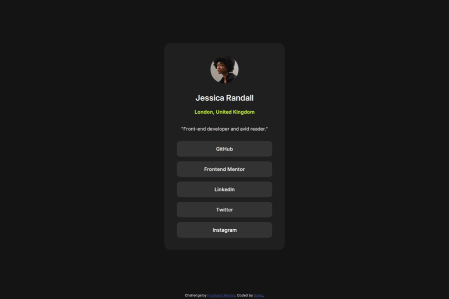
Design comparison
Community feedback
- @AdrianoEscarabotePosted 5 months ago
Hi andreshinostroza, hope you're doing well! I loved how your project turned out, but I’ve got a few suggestions that could be useful:
To enhance the semantics of your code, consider using a
<ul>(unordered list) for the collection of links, as it represents a list of related items. Here's an example:<ul> <li><a href="#">GitHub</a></li> <li><a href="#">Frontend Mentor</a></li> <li><a href="#">LinkedIn</a></li> <li><a href="#">Twitter</a></li> <li><a href="#">Instagram</a></li> </ul>Using a
<ul>provides clear structure and context, signaling to both browsers and assistive technologies that these links are part of a cohesive group, improving both accessibility and readability.The rest is fantastic.
Hopefully, you'll find it helpful. 👍
0 - @st0272Posted 5 months ago
Your code is well-structured, but there are several points for improvement:
1. Accuracy of Sizes
- Font sizes: Each font size is 1 or 2 pixels larger than the design file.
- Margin: The margin size for the text "London, United Kingdom" is slightly wider than expected.
2. Unnecessary CSS Styles
h1andh2classbg-c: Theprincipalclass already applies the samebackground-color: var(--Gray-800), making this redundant.enlaceclass: Thecursor: pointerstyle is unnecessary since it is the default behavior for anchor (<a>) tags.
I think it could be even better with a little more attention to detail. Keep up the good work!
0
Please log in to post a comment
Log in with GitHubJoin our Discord community
Join thousands of Frontend Mentor community members taking the challenges, sharing resources, helping each other, and chatting about all things front-end!
Join our Discord
