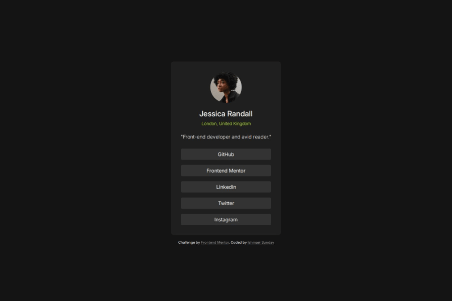
Responsive social links profile landing page | HTML5, CSS3


Design comparison

Solution retrospective
- Incremental growth(3 days, 3 builds completed).
- Learning agile(Being able to build a new component almost everyday towards completing my beginner level).
- Next time I'd like to decrease development time by 30mins.
- My button link color turns blue on iphone. I have not been able to fix that yet.
- My button link color turns blue on iphone. I have not been able to fix that yet.
Community feedback
- P@olaide-hokPosted 2 months ago
Use rem Units Consistently: Some font sizes use rem (e.g., 1.5rem), while others use px (e.g., 24px).
The hover and focus styles for .profile-links a are combined, which can make debugging harder. Separate them for clarity.
.profile-links a:hover { background-color: var(--accent); color: var(--body-bg); }
.profile-links a:focus { background-color: var(--accent); color: var(--body-bg); }
The media query for min-width: 576px repeats styles that are already defined (e.g., .profile width is set to 100% again). Only include styles that change in the media query.
Selectors like .profile p and .profile h1 are overqualified. This can make the CSS harder to read and maintain. A fix would be to use simpler class-based selectors where possible. For example: .profile-title { font-size: 1.5rem; font-weight: 500; margin-bottom: 0.5rem; }
.profile-description { font-size: 1rem; font-weight: 300; margin-bottom: 0.7rem; letter-spacing: 0; }
1P@okayishmaelPosted 2 months ago@olaide-hok
Use rem Units Consistently: Answer
- I fixed that. thanks a million.
The hover and focus styles for .profile-links a are combined, which can make debugging harder. Separate them for clarity.
Ans
- I fixed that to help and newbies to understand the code. But it seem like writing repeated code since they both have the same style
The media query for min-width: 576px repeats styles that are already defined (e.g., .profile width is set to 100% again). Only include styles that change in the media query.
Answer
- the media query didn't repeat the code. I have the profile width set to 90% and margin auto to center for mobile. for screens I set it to 100% because it causing a line break in the profile bio/"description"
Selectors like .profile p and .profile h1 are overqualified. This can make the CSS harder to read and maintain. A fix would be to use simpler class-based selectors where possible. For example: .profile-title { font-size: 1.5rem; font-weight: 500; margin-bottom: 0.5rem; }
Answer
- I fixed thanks for the tips
Cheers!
0

Please log in to post a comment
Log in with GitHub
Join our Discord community
Join thousands of Frontend Mentor community members taking the challenges, sharing resources, helping each other, and chatting about all things front-end!
Join our Discord