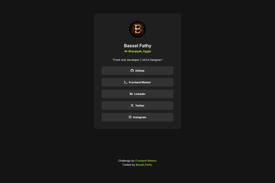
Design comparison
Solution retrospective
Proud of using Font Awesome library for first time to handle social icons.
- Using
justify-contentproperty onmainto center the card overrode the card width property. - overcome by using
justify-selfinstead on card itself.
Any feedback would be appreciated!
Community feedback
- @dylan-dot-cPosted 4 months ago
All looks good here and well written code! Only thing to do is actually link your socials here(if you want that is).
I loved how you used the icons here as well. Font Awesome is actually nice. You can animate them as well if you want(fontawesome has some animation classes).
For the attribution, if you put it in the div with the card(might need an extra one) you could add a margin to make it closer to the card on larger screens and making the card more vertically centered.
ANyways well done.
0@BasselfathyPosted 4 months ago@dylan-dot-c Thanks Dylan! Really appreciate your feedback. It's very interesting to know that font awesome provides animation feature, I'm still exploring it.
1
Please log in to post a comment
Log in with GitHubJoin our Discord community
Join thousands of Frontend Mentor community members taking the challenges, sharing resources, helping each other, and chatting about all things front-end!
Join our Discord
