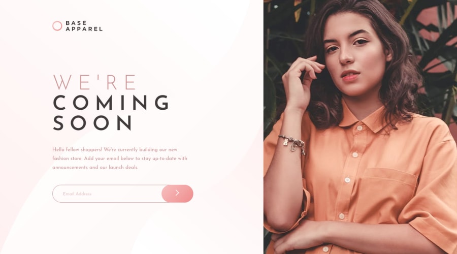
Design comparison
Solution retrospective
Wondering if there is a better way to position/size the background image so that it still matches the design but doesn't tile at some views? It seems the svg given is sized to match the design at 1440 when using contain but then will tile at bigger/odd sizes. Other than that I felt the design went pretty straightforward but always appreciate any feedback! Thanks!
Community feedback
- @dewslysePosted about 3 years ago
Awesome implementation Ryan 🔥🔥. I wish I had an answer to your question. Faced a similar issue when I completed this challenge. Anyways, remember to add
aria-labelto your<button>and also the<section class="hero"></section>is missing anh.0
Please log in to post a comment
Log in with GitHubJoin our Discord community
Join thousands of Frontend Mentor community members taking the challenges, sharing resources, helping each other, and chatting about all things front-end!
Join our Discord
