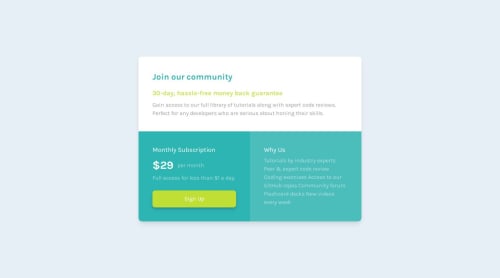
Design comparison
Solution retrospective
What did you find difficult when creating the project?
I couldn't adjust the text of the third field, otherwise I had no difficulty :)
Which areas of your code are you unsure about?
In the text
Community feedback
- P@tedikoPosted 11 months ago
Hello @ArdaBozan! Good job on this challenge! Here's my few suggestions:
- Don't separate your HTML class names with "|". Separate the class names with a space, e.g.
<div class="class1 class2">
. - I'd use only one paragraph for your
.price
and.opacity
text. Wrap opacity text intospan
element and style it. This will also get rid of.price-block
div. - Your
<button>
element should be<a>
anchor. Links take the user to a new location, such as a new web page or new section of the current page, buttons trigger some action, such as showing content on the page that was previously hidden, playing a video, or submitting a form. To me "Sign up" will take user to new page.
Have fun!
Marked as helpful1@ArdaBozanPosted 11 months ago@tediko
Thanks for the advice! The reason I separate classes in that way is because I heard it from someone experienced who said it didn't cause any issues, and the reason for separating them is to distinguish between a class I've previously created and a new one I'm going to create. And yes, yes :D I didn't establish the link because it's just a design.
0 - Don't separate your HTML class names with "|". Separate the class names with a space, e.g.
Please log in to post a comment
Log in with GitHubJoin our Discord community
Join thousands of Frontend Mentor community members taking the challenges, sharing resources, helping each other, and chatting about all things front-end!
Join our Discord