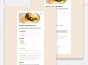
Design comparison
Solution retrospective
.
What challenges did you encounter, and how did you overcome them?.
What specific areas of your project would you like help with?.
Community feedback
- @erensaracPosted 12 months ago
Congratulations! @brane10
I reviewed your solution. Your solition looks great. I wanna help you with some feedback. First of all, You must have missed the margin at the bottom. Starting from the top, the recipe description paragh on the header, need a colour change. I suggest to add
color: var(--neutral-wenge-brown)to p tag and in this section recipe tittle could be bigger then now. At the Nutrition section, paragragh color looks wrong like a at header. Also this paragraghfont-sizeproperty looking wrong. And the last thing of my suggestions, you can change the text colour left column of the table. I hope my suggesttions helps you.Happy Coding!
Marked as helpful1 - @brane10Posted 12 months ago
Thanks for the observation. I will apply your suggestions. :)
2 - @Alexandru736Posted 12 months ago
Hi! The implementation looks good but you missed some design points like the bottom margin of the recipe container and the text color of the nutrients section but these are small details. Other than that, keep it going!
0
Please log in to post a comment
Log in with GitHubJoin our Discord community
Join thousands of Frontend Mentor community members taking the challenges, sharing resources, helping each other, and chatting about all things front-end!
Join our Discord
