Design comparison
SolutionDesign
Solution retrospective
What challenges did you encounter, and how did you overcome them?
Took notice that in order to center the container, we need to define width and height to it's parent.
Community feedback
- P@isioma-talabiPosted 8 months ago
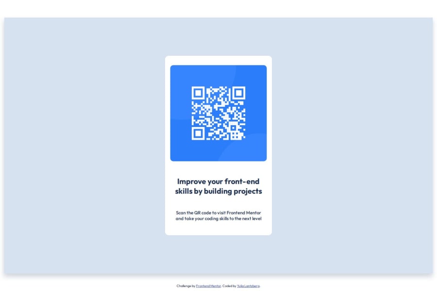
Your current design seems to be much smaller than the solution. To rectify this, use the dimensions set in the Figma design for the card which is
width: 320px,height: 499px. I hope this helps.Marked as helpful0
Please log in to post a comment
Log in with GitHubJoin our Discord community
Join thousands of Frontend Mentor community members taking the challenges, sharing resources, helping each other, and chatting about all things front-end!
Join our Discord
