

Design comparison

Community feedback
- P@emkumaPosted 5 months ago
I would place the design in the middle of the viewport.
I'm just a newbie to css. Your css code looks "clean". Your code uses more sophisticated techniques than mine.
Good job!
Marked as helpful1@iMohamed-EPosted 5 months agoYeah you can do that too but i wanted the text underneath it to bo close to it too , but ty <3@emkuma
0@KapteynUniversePosted 5 months ago@iMohamed-E For better centering, you can use flex or grid.
body {
display: flex;
justify-content: center;
align-items: center;
min-height: 100vh;
}
or
body {
display: grid;
place-content: center;
min-height: 100vh;
}
Try to avoid hard coded values like
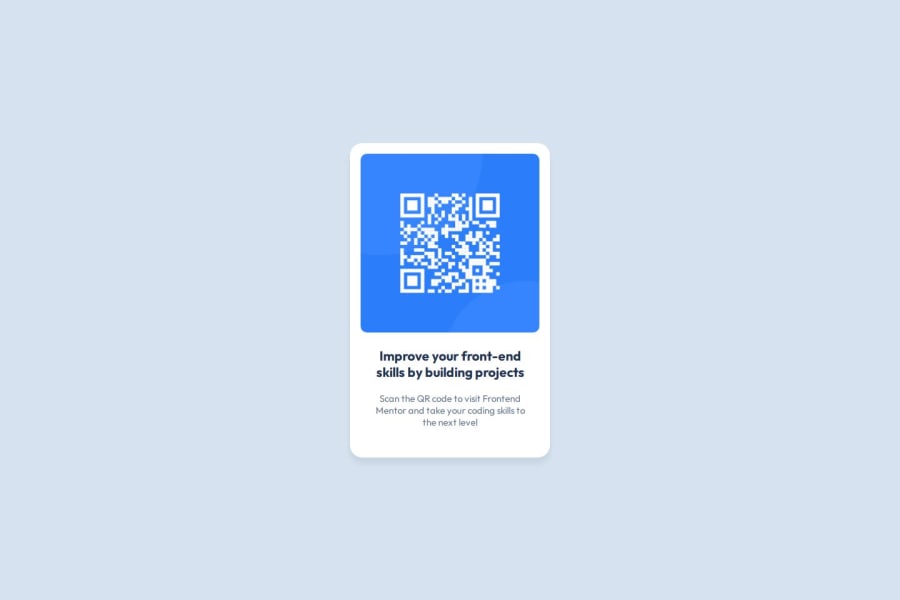
width: 350px;, usemax-width: 350px;instead,max-width: 20 remwould be even better. Using em/rem units is better for responsiveness.Images need meaningful alt texts, unless they are decorative. For this challenge, something like "Frontendmentor.io" or "QR code to Frontendmentor.io" would be better i believe.
Marked as helpful1@iMohamed-EPosted 5 months agoTy so much , that was helpful and i will work on it <3 @KapteynUniverse
1 - @ness505Posted 5 months ago
This comment was deleted 3 months ago
1


Please log in to post a comment
Log in with GitHubJoin our Discord community
Join thousands of Frontend Mentor community members taking the challenges, sharing resources, helping each other, and chatting about all things front-end!
Join our Discord