

Design comparison

Solution retrospective
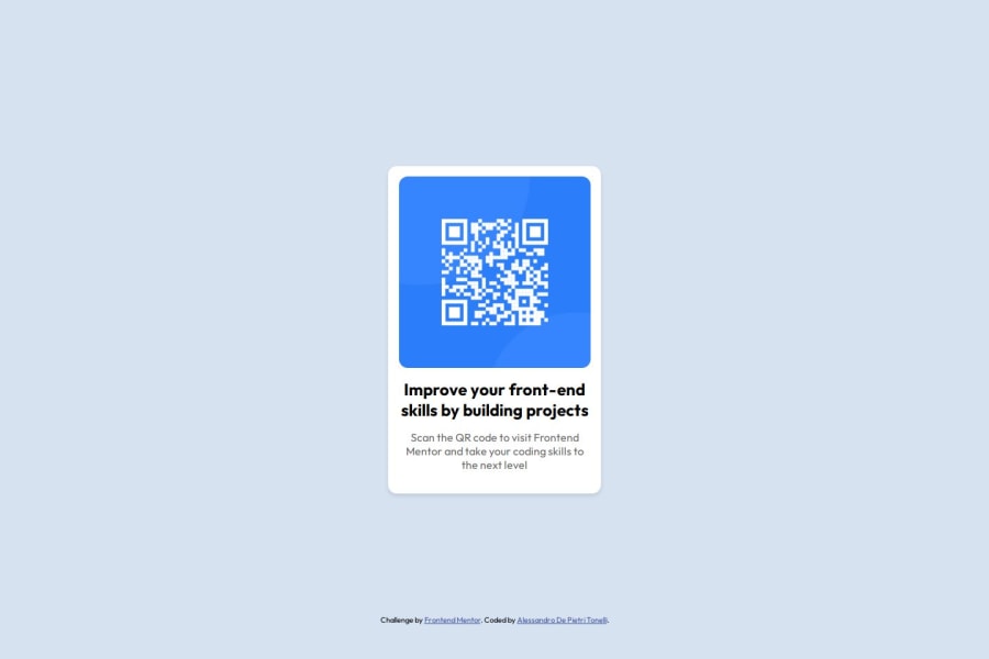
I’m proud of having created the card using only HTML and CSS, as I’m usually accustomed to using Bootstrap.
What challenges did you encounter, and how did you overcome them?Using media queries, grid layout, and custom CSS was a stimulating challenge. I referred to the official documentation and my Notion notes to complete the project.
What specific areas of your project would you like help with?I’d like to deepen my understanding of grid layout and gain more mastery in using vh and rem units
Community feedback
- @MarziaJaliliPosted 2 months ago
Congrates buddy,
Some tips for you to consider in your next projects:
- Using grid to center the card is much more consice:
body { display: grid; place-items: center; }- Also, avoid using a fixed height
(line 17 in style.css).
This may not make anything go wrong in this challenge 'cause there's only one card and the screen doesn't get larger then 100%, but in others that do get larger it's going to be an issue, man.
Instead use
min-height: 100vhOther than this your web looks AWESOME😎.
keep up the great work 💪
Marked as helpful0@adptCodePosted 2 months ago@MarziaJalili thank you very much for these important suggestion!
1 - @skyv26Posted 2 months ago
Hi @adptCode, 👋
Great effort on the CSS styling! I noticed that while the original styles were functional, some parts could be simplified to reduce redundancy and improve maintainability. 😊 Here's what I did to help streamline things:
1️⃣ Unnecessary Classes Removed: I identified and removed a few extra classes and styles that were either unused or redundant, keeping only the essential ones for clarity and efficiency.
2️⃣ Improved Readability: The concise code now feels easier to read and manage, which can be helpful when debugging or making updates in the future.
3️⃣ Preserved Functionality: I ensured that the updated styles retain the exact look and feel of the design as intended, so no changes were made to the UI/UX.
Revised CSS:
.attribution {
    font-size: 11px;
    text-align: center;
    transform: translateY(1rem);
}

.attribution a {
    color: hsl(228, 45%, 44%);
}

body {
    font-family: "Outfit", serif;
    background-color: hsl(212, 45%, 89%) !important;
    margin: 0;
    height: 100vh;
    display: flex;
    flex-direction: column;
    justify-content: center;
    align-items: center;
}

/* Card Styles */
.card {
    background-color: #fff;
    border-radius: 13px;
    box-shadow: 0 4px 6px rgba(0, 0, 0, 0.1);
    max-width: 310px;
    overflow: hidden;
    text-align: center;
    padding: 16px;
    transition: transform 0.3s, box-shadow 0.3s;
}

.card-image {
    width: 100%;
    border-radius: inherit;
}

.card-title {
    font-weight: 700;
    font-size: 1.5rem;
}

.card-text {
    font-weight: 400;
    font-size: 1rem;
    color: #666;
}
Let me know what you think or if there’s anything you'd like to tweak further. Happy coding! 🚀
Marked as helpful0 - @skyv26Posted 2 months ago
You can see that it is far better and more understandable than before. Rest you did great.
0


Please log in to post a comment
Log in with GitHubJoin our Discord community
Join thousands of Frontend Mentor community members taking the challenges, sharing resources, helping each other, and chatting about all things front-end!
Join our Discord