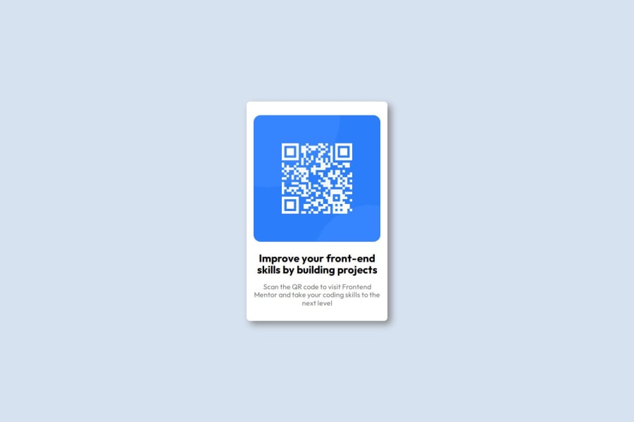
Design comparison
Solution retrospective
I think this was a fairly basic one but it feels nice to be able to know the bare minimum that I do and replicate it
What challenges did you encounter, and how did you overcome them?I still struggle with aspects of width and height / length, it's hard to understand what takes up what space
What specific areas of your project would you like help with?Is my project responsive? Does it match the mobile layout?
I would also like assistance in the height x width/length topic
Community feedback
- @gmagnenatPosted 6 months ago
Hello, congrats for giving this challenge a try!
Here are a few things you may want to check before moving to other challenges:
- You need to have a
<main>landmark. It indicates where the main content of the webpage is. - You should read about how to write good alt text. There are great resources for this on the Discord. For example, you should avoid using words like "image" in an alt attribute. It needs to describe the image for users who cannot see it, as they already know it's an image.
- Remove the
widthandheightattributes you have set in the HTML on the image. In some cases, the image cannot adapt to fill its parent width and will stay at the288value you have set. - It looks like you are confused about when to use margin and padding. Here is a good article about it: https://fedmentor.dev/posts/padding-margin/.
- It is a good practice not to style your HTML elements directly but to use a class on elements you want to style. Try to keep the specificity at the lowest level and only increase it when really necessary.
- Having an
<h2>for the title is fine here as this is a single component and not a full page. If you put this component in context it would probably sit on a larger page with other components.
2 - You need to have a
- @ortiz-antonioPosted 6 months ago
Good job making your design responsive! Maybe you can improve its appearance by viewing the sizes in the Figma design and adjusting the following:
- Padding
- Border radius
- Font styles
If you want to improve the quality of the code, follow BEM or another CSS methodology.
0
Please log in to post a comment
Log in with GitHubJoin our Discord community
Join thousands of Frontend Mentor community members taking the challenges, sharing resources, helping each other, and chatting about all things front-end!
Join our Discord
