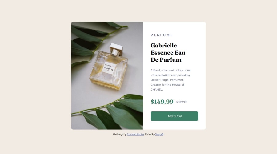


Design comparison

Solution retrospective
What did you find difficult while building the project?
Setting the images found in images folder to fit into the webpages and change depending on the screen size of the user's device.
Do you have any questions about best practices? The solution I found to deal with the difficulty earlier, was it the best or are there better ways to get it done?
Community feedback
- @ahmedafsaPosted 12 months ago
Hello @Singraft, Well done!
Some suggestions to enhance the code further:
- CSS Grid is best for the two-dimensional layouts with many elements that need to be precisely positioned relative to each other, while Flexbox is better for one-dimensional or single-line layouts where you just need to space a bunch of elements a certain way. So in case of the card in the challenge, it's better to use CSS Grid like the following:
.your-container-div {
  display: grid;
  grid-template-columns: 1fr 1fr;
  max-width: 600px;
}
This will align the product image (left-side) next to the details (right-side) directly, making the code better and easier and It will also help us in making the component responsive by converting the layout from two columns to one column through media query, like this:
@media(max-width:600px) { .your-container-div { grid-template-columns: 1fr; } }- Regarding the product image It is better to use the
<picture>element with<source>tags to make the product image responsive where based on your screen width, the appropriate image will be loaded
<picture>
  <source
    srcset="images/image-product-mobile.jpg"
    media="(max-width: 600px)"
  />
  <source
    srcset="images/image-product-desktop.jpg"
    media="(min-width: 601px)"
  />
  <img src="images/image-product-desktop.jpg"/>
</picture>
I hope these suggestions are helpful. Best wishes to you!
Marked as helpful1@onyedikachi23Posted 12 months ago@ahmedafsa for that challenge, Flexbox is just what he needs for changing the alignment of the two sections.
For the mobile devices:
.flex-container {
    display: flex;
    flex-direction: column;
}
For the desktop breakpoints
.flex-container {
    flex-direction: row;
}
This is the best option for a beginner, than facing the 2-D structuring of the Grid Layout.
Marked as helpful1@grace-snowPosted 10 months ago@OnyedikachiOzoani id choose grid over flex for this as the code is shorter for getting two equal width columns. Theres nothing wrong with either approach but grid is slightly shorter
1@grace-snowPosted 10 months ago@ahmedafsa this is great feedback, just a few minor ammendments
- The mobile styles should almost always be the default. This means switching to min width media queries and making the mobile image the default in the picture element too. Much better for performance and UX.
- Set max width on the component in rem not px. This ensures the component works for those of us who change our base font size
- Media queries (in both the css and in the picture element) must be defined in rem or em not px. Again this means that those of us who change our base font size don't get a broken layout on some screen sizes. It means we will see the mobile and desktop layouts at appropriate sizes for the font size we are using.
- In the picture element you don't need two sources like that. Make the mobile image the default in the img element. Make the desktop img url sit in the source tag with an appropriately sized (in rem or em) min width media query
Marked as helpful1@dongmo-shuPosted 10 months agoGreetings @grace-snow
I implemented points 2 and 3 of your feedback. I can see the improvement in the page on mobile screens.
As for point 1, I will keep that in mind for future challenges. My approach was to have the desktop style be the default.
As for point 4, I will keep the code the way it is. the solution works as intended, and I am happy with the result. Your approach can work, back when I submitted this solution, I didn't know how to.
I appreciate your feedback, and i hope to receive more in the solutions I will provide in the future.
0@dongmo-shuPosted 10 months agoHello @ahmedafsa
You are right. the best way would be to use CSS Grid for this challenge, due to its nature. I will keep this approach in mind for the future.
I appreciate your feedback, and I hope you will share more in my future solutions.
0@grace-snowPosted 10 months ago@Singraft I'm afraid your image method element is not working as intended. If you check the network tab in devtools, filtered to show images only, it should only be downloading the one image you want to serve. But at the moment, it is downloading both. The whole point of using the picture element is to avoid this and give the performance boost of only downloading necessary assets.
Also, I notice there are white corners showing on the component overlapping the corners of the image. This is because
- You are setting incorrect border radius on the component on mobile
- You should be setting the component to have overflow-hidden so it crops out the overlapping image corners. You are setting border radius again on the img element when it doesn't need it at all.
There are other things I notice in this that you need to fix. You may not understand yet why they are big problems but if you don't break the habits now you'll be in a world of pain later on in bigger challenges.
- Do not set height on the component. Never limit the height of any element that contains text. This breaks badly for me when I change font styles. Additionally, we build components that can consume different amounts of content from authors/editors. As soon as you limit height, that component will need it's height adjusting every time there's a content change!
- Similarly, the component should not have a width. Use max width instead, and make sure it's in rem so it works well no matter what the user's font size. (Also note it is a WCAG accessibility requirement for sites to work at 320px wide without needing horizontal scroll - another reason why max-width is preferable)
- Only use rem for border radius if you want it to scale with font size. Often that's not desirable, in which case you may prefer to use px
- The white area of the card (
.info-area) should have padding on all sides - Remove all these extra divs!! Always keep the HTML nodes to the minimum required. This is creating a load of extra elements for no reason. Inside the white area of the card, all the content can and should be direct children
- As this is a product card component, it is highly unlikely to contain the page heading (h1). It's much more likely to be placed on a grid of cards or sidebar of another page alongside other product cards. That tells you the heading level should at least be h2 in this
- Always use headings appropriately and in the correct order to communicate content structure. A price will never be a heading. The prices are a paragraph, with a strikethrough or delete element for the old price.
- Speaking of the old price, make sure it is communicated to screen readers that it is the old price. For example, include a span with sr-only class on it saying "original price" or similar before the strike through text.
- If using flex, use gap! Don't place random paddings or margins on certain child elements when you have gap available to use.
- Probably should have been the first point tbh - Always use a modern CSS reset at the start of the styles in every project. Get into that habit. Andy Bell has a good one.
0@onyedikachi23Posted 10 months ago@grace-snow I know you're my senior but I still believe readability of the code is better.
0@grace-snowPosted 10 months ago@OnyedikachiOzoani it sounds like you've missed the point. My feedback is not about readability it's about performance. It makes no difference whether flex or grid is used but neither approach is more or less readable than another. (That is down to your own experience / preferences which one you personally find more readable). One is shorter than the other that is all
1


Please log in to post a comment
Log in with GitHub
Join our Discord community
Join thousands of Frontend Mentor community members taking the challenges, sharing resources, helping each other, and chatting about all things front-end!
Join our Discord