Design comparison
Solution retrospective
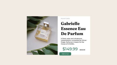
Could you give me feedback on how to make the bg-img better?
also how to put the crossed line in the 169 please
Community feedback
- @hitmorecodePosted over 1 year ago
Congratulations well done. For the crossed line, it's an easy fix.
/* you need to change the order */ <p><span>$149.99</span> $169.99 </p> /* do it like this */ <p>$149.99 <span>$169.99</span> </p>
/* add this in your css and it should work */ p span { text-decoration: line-through }
For your question about how to make the image better. Can you be more specific what you mean.
Make the header font-size a bit smaller, because now the button is almost out of the card and you still need to add the image on the button.
See if you can fix this, if not let me know.
Marked as helpful1@JoelHernEspPosted over 1 year ago@hitmorecode With the bg-img I mean when the photo was transferred to a mobile it was not visible, I had to add a "." like p check the html so you can see what i mean
btw thx for the line through
0 - @Amanmawar17Posted over 1 year ago
Hello, buddy! your add to cart it should be a button, not an anchor tag, and you should reduce the font size of the heading when it's on responsive screens. Also what you can do with images that don't put them as background img but in img tag under div tag make them hidden or visible with media query. Good Attempt by the way. Thank You.
0 - @Aimal-125Posted over 1 year ago
Bro in your css code, increase the height of body element to 120 or 150vh by using media query with max-height: 400px; So that it looks good on small heighted screens as mine (samsung j3). Otherwise your solution is looking perfect!
0
Please log in to post a comment
Log in with GitHubJoin our Discord community
Join thousands of Frontend Mentor community members taking the challenges, sharing resources, helping each other, and chatting about all things front-end!
Join our Discord