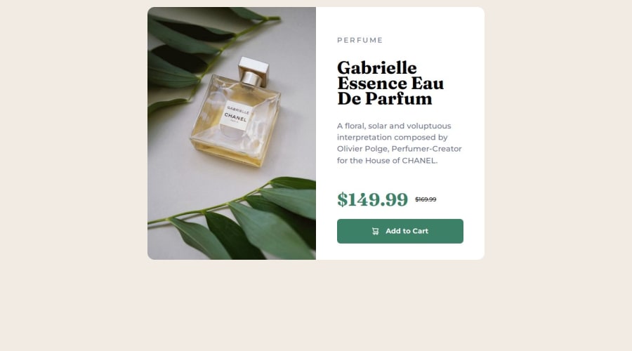
Design comparison
SolutionDesign
Solution retrospective
What are you most proud of, and what would you do differently next time?
Start to learn responsive layout and media queries. Structuring HTML and CSS becomes more and more routine. Maybe use figma file to stop guesswork?
What challenges did you encounter, and how did you overcome them?using em, rem and pixels. Watched video.
What specific areas of your project would you like help with?Comments on proper structuring, use of BEM maybe?
Community feedback
- P@gusanchefullstackPosted 6 months ago
Good job. I suggest a margin top of container in desktop media querie for 175px.
Marked as helpful1
Please log in to post a comment
Log in with GitHubJoin our Discord community
Join thousands of Frontend Mentor community members taking the challenges, sharing resources, helping each other, and chatting about all things front-end!
Join our Discord
