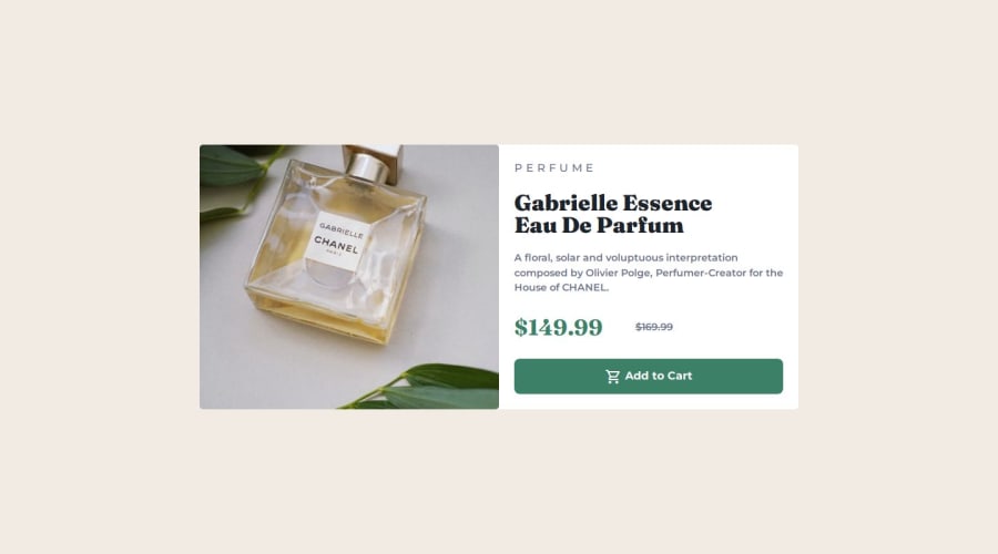
Design comparison
Solution retrospective
Overcame a few challenges and got a pretty decent result
What challenges did you encounter, and how did you overcome them?n/a
What specific areas of your project would you like help with?n/a
Community feedback
- @StroudyPosted about 2 months ago
Exceptional work! You’re showing great skill here. I’ve got a couple of minor suggestions that could make this stand out even more…
-
I think you can benefit from using a naming convention like BEM (Block, Element, Modifier) is beneficial because it makes your CSS more organized, readable, and easier to maintain. BEM helps you clearly understand the purpose of each class, avoid naming conflicts, and create reusable components, leading to a more scalable codebase. For more details BEM,
-
For future project, You could download and host your own fonts using
@font-faceimproves website performance by reducing external requests, provides more control over font usage, ensures consistency across browsers, enhances offline availability, and avoids potential issues if third-party font services become unavailable. Place to get .woff2 fonts -
Using
remoremunits in@mediaqueries is better thanpxbecause they are relative units that adapt to user settings, like their preferred font size. This makes your design more responsive and accessible, ensuring it looks good on different devices and respects user preferences.
I hope you’re finding this guidance useful! Keep refining your skills and tackling new challenges with confidence. You’re making great progress—stay motivated and keep coding with enthusiasm! 💻
0 -
- @miedzygalaktycznygitPosted about 2 months ago
Looks good to me,
You did a good job keep it up0
Please log in to post a comment
Log in with GitHubJoin our Discord community
Join thousands of Frontend Mentor community members taking the challenges, sharing resources, helping each other, and chatting about all things front-end!
Join our Discord
