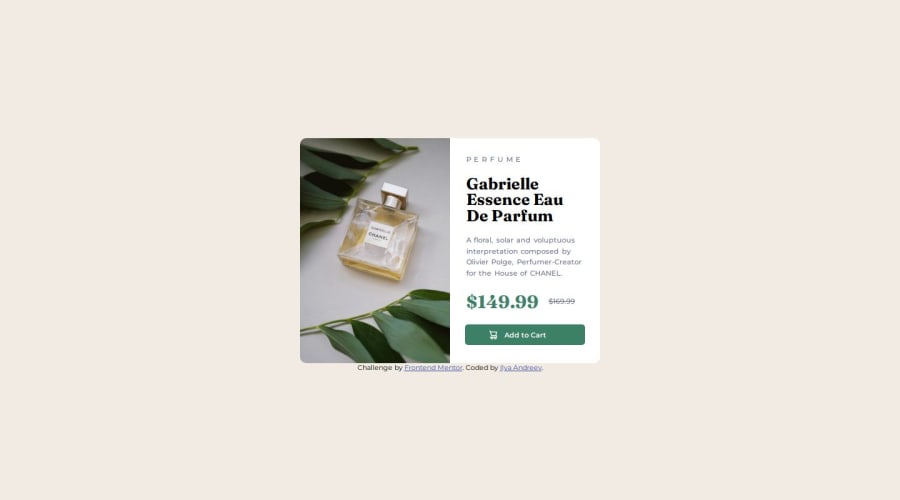
Responsive product card preview made using CSS
Design comparison
Solution retrospective
The hardest thing was to align the elements in the right part of the card so that they look good in the mobile layout as well
Community feedback
- P@danielmrz-devPosted about 1 year ago
Hello @NeoScripter!
Your project looks great!
I have a suggestion about your code that might interest you:
📌 You can use the
<picture>tag when you have different versions of the same image 🖼. Using the<picture>tag will help load the correct image to the user's device, saving bandwidth and improving performance.Example:
<picture>
    <source media="(max-width: 460px)" srcset="{desktop image path here}">
    <img src="{mobile image path here}" alt="{alternative text here}">
</picture>
I hope this helps!
Other than that, excellent work!
Marked as helpful1@NeoScripterPosted about 1 year ago@danielmrz-dev Thank you for your suggestion, it didn't work at first, but then I changed the CSS settings and it worked like a charm! Thank you!
1 - @hitmorecodePosted about 1 year ago
Nice well done. I took a look at what you did and I have a few suggestions;
- Remove max-width on .wrapper change it to width
- Inside the media query add a width of 300px to .wrapper
- On the bottom of the card you have both price and link/button inside the same div. Use two different div's for this. So that you can move the price and leave the button in the center of the card
0
Please log in to post a comment
Log in with GitHubJoin our Discord community
Join thousands of Frontend Mentor community members taking the challenges, sharing resources, helping each other, and chatting about all things front-end!
Join our Discord
