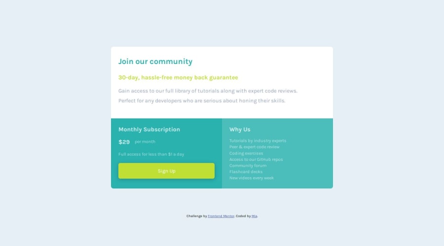
Design comparison
Solution retrospective
For this challenge, each text in each section had different styling. I am not sure if my css for text is as neat as it could be. I would like to know what the best way to write this is.
Community feedback
- @hitmorecodePosted 5 months ago
Congratulations looks good. Just a few tips.
- This is the first tip and it's a important one. Start applying CSS rest on your CSS. Here is a simple example of a CSS rest
// this will remove any unnecessary padding's and margin's on the entire page. * { margin: 0; padding: 0; box-sizing: border-box; }- In this case you don't need to use overflow you can remove this.
// this is very confusing. #join {background-color: hsl(0, 0%, 100%);} #join h1 {color: hsl(179, 62%, 43%);} #join h2 {color: hsl(71, 73%, 54%);} #join p {color:hsl(218, 22%, 67%);} #monthly {background-color: hsl(179, 62%, 43%);} #monthly h2 {color: hsla(0, 0%, 100%, 80%);} #monthly p {color:hsla(0, 0%, 100%, 60%);} #why {background-color: hsl(179, 47%, 52%);} #why h2 {color: hsla(0, 0%, 100%, 80%);} #why p {color:hsla(0, 0%, 100%, 60%); margin: 0px; line-height: 140%;} // try doing this instead, use root to declare your variables :root { --primary-cyan: hsl(179, 62%, 43%); --primary-cyan-a: hsla(179, 62%, 43%, 0.8); --primary-bright-yellow: hsl(71, 73%, 54%); --neutral-light-gray: hsl(204, 43%, 93%); --neutral-grayish-blue: hsl(218, 22%, 67%); --font-weight-400: 400; --font-weight-700: 700; } // after declaring the variables in the root, you can re-call them like this. body { font-family: "Karla", Arial, Helvetica, sans-serif; min-height: 100vh; background-color: var(--neutral-light-gray); // re-call variable display: flex; justify-content: center; align-items: center; font-weight: var(--font-weight-400); // re-call variable }- You can re-use these variables as much as you want. This is handy when you have to make changes, you only need to change in one place and it will apply to all places where it's being used.
- On the Why us section you used one p tag and used br to break the text to different lines. Try to avoid this, only use br when necessary. In this case you can just use a p tag for eacht line or you can use li.
// do this <ul> <li>Tutorials by industry experts</li> <li>Peer & expert code review</li> <li>Coding exercises</li> <li>Access to our GitHub repos</li> <li>Community forum</li> <li>Flashcard decks</li> <li>New videos every week</li> </ul> // or <p>Tutorials by industry experts</p> <p>Peer & expert code review</p> <p>Coding exercises</p> <p>Access to our GitHub repos</p> <p>Community forum</p> <p>Flashcard decks</p> <p>New videos every week</p>There are more things that you can fix. If you need aan example you can take a look at this. It's not perfect, there are a few things I could have done different. It's just to give an idea on how to make things simpler.
If you have any questions regarding this let me know. Keep it up 👍👌
Marked as helpful2
Please log in to post a comment
Log in with GitHubJoin our Discord community
Join thousands of Frontend Mentor community members taking the challenges, sharing resources, helping each other, and chatting about all things front-end!
Join our Discord
