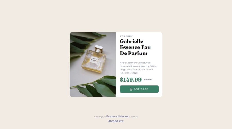
Design comparison
Solution retrospective
get used to making responsive pages
What challenges did you encounter, and how did you overcome them?writing the breakpoints
What specific areas of your project would you like help with?breakpoints and layout structure
Community feedback
- @Djamel1133Posted 7 months ago
Hello,
I hope you are well and learning effectively.
I really liked your solution, but I have a few suggestions for improvement:
1- Combining Media Queries You don't need to repeat the
@mediarule if the parameters do not change. For example, instead of:@media screen and (min-width: 1199px) { .perfume-img-mobile { display: none; } } @media screen and (min-width: 1199px) { .perfume-img-desktop { display: block; width: 50%; } }
You can combine them into a single media query:
@media screen and (min-width: 1199px) { .perfume-img-mobile { display: none; } .perfume-img-desktop { display: block; width: 50%; } }
2- Centering Grid Elements To center elements in a grid, you can use a single line of CSS instead of two separate lines. (align-items: center; justify-items: center;) use align-content: center;
3- Downloading and Referencing Fonts I prefer to download fonts and reference them using the
@font-facerule in my CSS file. This approach is generally faster (i think) and eliminates the need for third-party services.@font-face { font-family: 'YourFontName'; src: url('path/to/your/font.ttf') format('truetype'); } Have fun and code well!
Marked as helpful0 - P@StroudyPosted 7 months ago
Amazing job with this! You’re making fantastic progress. Here are some small tweaks that might take your solution to the next level…
-
This does not matter that much at this stage but something to be mindful of for SEO(Search Engine Optimisation),
<meta>description tag missing that helps search engine determine what the page is about, Something like this<meta name="description" content="description goes here" /> -
Using
remoremunits in@mediaqueries is better thanpxbecause they are relative units that adapt to user settings, like their preferred font size. This makes your design more responsive and accessible, ensuring it looks good on different devices and respects user preferences. -
For future project, You could download and host your own fonts using
@font-faceimproves website performance by reducing external requests, provides more control over font usage, ensures consistency across browsers, enhances offline availability, and avoids potential issues if third-party font services become unavailable. Place to get .woff2 fonts -
I think you can benefit from using a naming convention like BEM (Block, Element, Modifier) is beneficial because it makes your CSS more organized, readable, and easier to maintain. BEM helps you clearly understand the purpose of each class, avoid naming conflicts, and create reusable components, leading to a more scalable codebase. For more details BEM,
You’re doing fantastic! I hope these tips help you as you continue your coding journey. Stay curious and keep experimenting—every challenge is an opportunity to learn. Have fun, and keep coding with confidence! 🌟
Marked as helpful0 -
Please log in to post a comment
Log in with GitHubJoin our Discord community
Join thousands of Frontend Mentor community members taking the challenges, sharing resources, helping each other, and chatting about all things front-end!
Join our Discord
