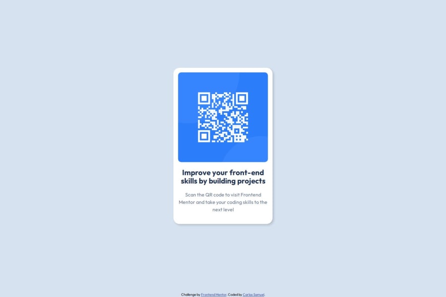
Design comparison
Solution retrospective
I'm proud that I managed to pin the footer to the bottom of the page and the speed with which I completed the challenge.
What challenges did you encounter, and how did you overcome them?I had some difficulty to pin the footer at the bottom of the page. So I searched on Internet how to do it and learned how to do it with Flexbox properties.
What specific areas of your project would you like help with?Any help is welcome!
Community feedback
- @MikDra1Posted about 2 months ago
Well done, here are some things to review 😊:
-
REM for Units: It's best to use
rem
for all units instead ofpx
, as this ensures scalability and consistency in spacing and font sizes based on the user's root font size. It helps improve accessibility. -
Semantic HTML: Consider ensuring all elements are wrapped in semantic HTML tags like
<main>
,<section>
, and<article>
to enhance the structure and SEO-friendliness of the page. -
BEM/Convention for Class Naming: Apply a class naming convention like BEM (Block Element Modifier) to make the styles modular and more maintainable. For example, use
.card__title
or.card--highlighted
. -
CSS Reset: Consider adding a full modern CSS reset (like normalize.css or custom resets at the beginning of the stylesheet) to ensure consistent styling across different browsers. Here is a link to one I really like.
-
Clamp() for Responsiveness: Use the
clamp()
function for fluid typography and spacing, allowing elements to resize smoothly between a minimum and maximum value based on the viewport size (e.g.,font-size: clamp(1rem, 2vw, 1.5rem)
). -
Responsive Card: To make the card responsive, ensure the layout uses
flex
orgrid
combined with max-width instead of fixed width values. This will make the design more flexible and adapt better to different screen sizes. -
Use max-width/min-width and max-height/min-height: Instead of using fixed
width
andheight
, opt formax-width
ormin-width
to allow the elements to resize smoothly on different screen sizes, improving overall responsiveness.
Hope you found this comment helpful 💗💗💗
Good job and keep going 😁😊😉
Marked as helpful2@CrtykwodPosted about 1 month agoHii @MikDra1! It was indeed very helpful, thank you!!!
I didn't know there was a naming convention for CSS classes, so i always used camelCase, good to know this.
I also didn't know about
clamp()
, I'm definitely going to search about to start using.Again, thank you very much for the time u take to write this review, it means a lot to me!!!
0 -
- @grace-snowPosted about 2 months ago
Hi, a few learning points from your code:
- definitely sort out the indentation so it's more readable as already mentioned. I think the issue is you are using tab spacing not spaces, and 2 spaces for that tab space is more common in settings than 4 if that helps. It looks OK when I open it in the github app but is so hard to read in mobile browser.
- all content should be contained within landmarks. This (and every page you ever do) should be inside a
main
landmark. That would replace what you have as the.back
div at the moment I think. (But you may want to change the subsequent class name so it isn'tmain
as that could get very confusing!) - the image is really important content in this component. The alt text is too vague at the moment (imagine this component being used alongside multiple QR code cards — they can't all have that alt text). This alt needs to say what the image is (QR code) and where it goes (to FrontendMentor.io).
- again, thinking about the context of how and where this kind of component would be used on a site, it would never be used to serve the main heading on a page. That means it shouldn't have a h1. Use a lower importance heading level like h2.
- it's better for performance to link fonts in the html head instead of css imports.
- you don't need charset in css.
- get into the habit of including a full modern css reset at the start of the styles in every project. Andy Bell or Josh Comeau both have good ones you can look up and use.
- don't apply the font family to a wildcard selector. That's also bad for performance. Instead place the font family declaration on the body and it will be inherited by child elements anyway.
- never limit the height of elements that contain text, including the body. Change that height 100vh to min-height. You don't want to limit it to only the height of a screen whose height you can never know, you want to tell the browser "make it at least that tall" but it's allowed to go beyond that height if it needs to.
- the component shouldn't have an explicit width, and especially not in pixels. Give it a max-width in rem, and optionally a width 100%. It's a similar principle to before but reversed. You want the component to be as wide as possible up until the limit you've set. But if the screen is narrower it would be allowed to go narrower. And by using rem for the max width it means the layout will scale correctly for all users including those who have a different text size. if I change my text size to 200% (32px) you'd want the card to get bigger along with the text not stay at a pixel value that would then look too narrow.
- I wouldn't expect any child elements within the card to need side margins. You already have padding set and text align center.
- the footer must not have a height and again not in pixels. Use padding if you want it to be taller than the text.
- this component is hitting all sides of my screen on mobile when it shouldn't. To avoid that give the body a little padding in px.
Marked as helpful2@CrtykwodPosted about 1 month agoHello @grace-snow! Thank you so much for the effort ant time to give my code this feedback. I'm definitely going to apply these advices on my next projects (unfortunately, I did the blog_preview challenge before seeing this).
Just one thing, should i use rem to all width and height or only in texts? Because it seems complicated to convert all measures, or perharps there's an easy way to do it?
0@grace-snowPosted about 1 month ago@Crtykwod it sounds like you're misunderstanding the feedback! It's very rare you would need to set width and height at all.
And rem are needed a lot. It's not tedious, there are lots of ways to do those conversions, the important thing is to understand why it matters so much.
This may help explain the importance of rem: https://fedmentor.dev/posts/font-size-px/.
Even if you've tried another challenge, refactor this one and apply the same learnings to any others.
0@CrtykwodPosted about 1 month ago@grace-snow, I refactored my code as you advised me!
Reading the article clarified my question about rem and em, thanks. I think the biggest problem here was the language barrier, most of the time it's hard to me to express what I'm thinking in english. :/
2@alberto-rjPosted about 1 month agoOi Carlos, parabéns pelo seu esforço!
Sinta-se á vontade para poder trocar ideias em portguês comigo, se precisar! 😊😉
0 - @JosephEnigmaticPosted about 2 months ago
Hi, if you're going to use a footer tag, you should also use a main tag
2
Please log in to post a comment
Log in with GitHubJoin our Discord community
Join thousands of Frontend Mentor community members taking the challenges, sharing resources, helping each other, and chatting about all things front-end!
Join our Discord